Well, this is your 'Afterlife' challenge entry. I think you met the challenge in a very creative and evocative way. I am sure most everyone would see the connection, although you probably suffered some low votes from people that simply are put off by this type of image. Still, a 5.
9 is not a bad score at all, so obviously the execution of your idea was not bad.
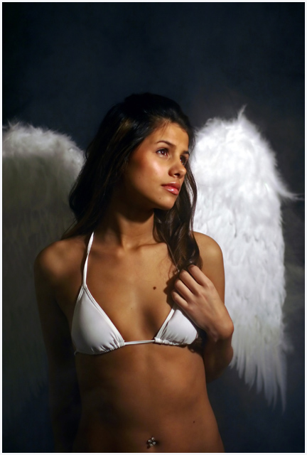
My first impression upon looking at the image is the grasp of your concept. The idea is definitely effectively portrayed. The model is quite attractive, and the costume seems to nicely fullfill your 'vision' without going overboard.
Your technicals here are pretty good. Focus is great. Deeper dof might have been nice, to get focus on the wings, but I'm not put off at all by the choice of going shallower. The lighting is good, but I could suggest maybe adding some type of fill light from the front left, even some reflectors. I think this could soften the shadow behind her hand and on the neck, as well as bring out just a touch more detail in her hair.
I like the composition with the exception of one thing, the empty space above her head :-) In this case, the space doesn't seem to serve any purpose, and I get a feel of being slightly unbalanced. Her gaze is going off to the right, maybe if she was looking more upwards, the space could come into play, but I don't think that would have worked as well. I believe the composition would be stronger with the framing tighter to her head. Her pose is nice. And I like how you've framed her slightly off centered. A minor attention to detail thing-the strap that is showing has a twist in it, little details like that can add up to increase the power of a photo, IMO.
Overall, a very nice image. A pleasing, creative take on the challenge, albeit one that as I'm sure you knew could polarize some of the voters. Well done, and I like the photo. I think the tighter crop (space at top) could have surely pushed your score above 6. Nice job.
If you have any questions, or comments or anything, please feel free to contact me.
I was really sorry to see this finished 23rd...it deserved a ribbon...what a beautiful angel! I love the light and the pose and the colour, this is a stunning photograph
Nice image, I scored it a 10. I would have scored it around 8 because the cropping bothers me, but I gave you extra points because I knew you were gonna get slaughtered by "prude" votes.
It's hard to put any iamge of a skantly clad sexy woman into a challenge here and do well. There are those here that think the photog is using sexuality to gain higher votes. I'll give you an example from my portfolio that recieved a HIGH number of low votes for that reason.
I gave it an eight in voting but was disturbed at the cropping. I think it shows much better without as much "negative" space above her head. Gorgeous model, great lighting - just out of balance a little.
To me, this is a very beautiful image. But there is one area that I find quite distracting and out of place. The bikini style and make. It doesn't fit the theme of the angel. The light just glows off it which draws the viewers eye to there and less on the beautiful model and the theme. Try a less prominent costume to go with the wings and I think this would be a winner.
Another well thought out reason to put scantly clad women in a photo. Thank you.. Good lighting, Good focus, exelent color, the composition works well. The wings, look good, enjoyable image, and fits the challenge. 10
Sorry but I don't see any connection to the concept 'Afterlife'. Yet, nice work with soft lighting and focus
Edit: Sorry again, May be I was in a bad mood. It does connect nicely bt I may not like the way it does the connection but that doesn't matter. What matter is how the work has been done. Cool
oooh la la...what a stunningly beautiful girl and a spectacular photo. I hope this wins...in fact, I hope that my guardian angel looks like this! I love the depth of field and the lighting







 Add photograph to your favorites
 Add photographer to your favorites

 Photographer found comment helpful.


