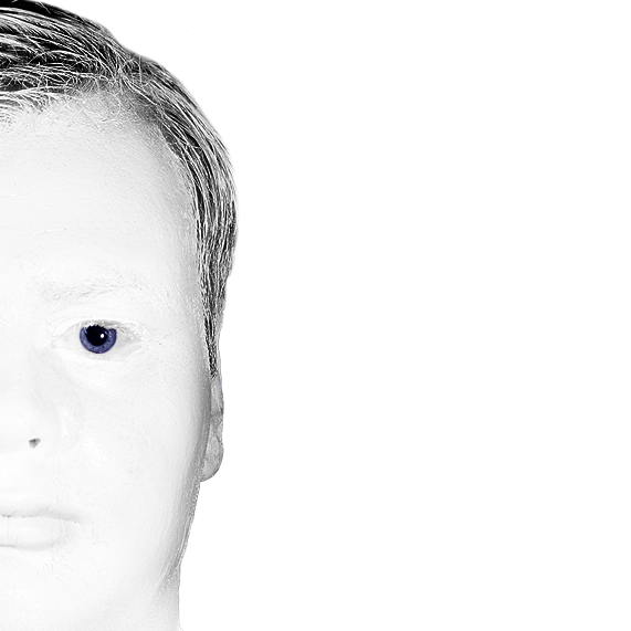
I very much like this. Great focus, good use of color (or lack thereof) and attention to detail. I like the half face as that leaves more room for the background, bringing attention to the fact that the background and face are so alike.
IMHO, I really think that this shot does not do justice to the rest of your portfolio. While on a techical level I guess it is pretty good, but I've learned that very high keyish type photographs (which is often used to mask other imperfections) does not go down too well on DP. This just feels too harsh on the eyes.
The composition just doesn't do it for me. Difficult to read the photograph, and I can't quite put my finger on it... but there almost feels as if there is something wrong with the photograph (hope I make sense).
JohnBeebe summed it up. This is technically a great image, and is very emotive. It's one of these out-of-the-box images (for DPC anyway) that voters will either love or hate.
Personally, I loved it. I can appreciate the trouble you went to to set this up, and I think it was very underrated in the voting. I don't see anything technically wrong with it, and can't give any advise how to 'improve' it. It's just the luck of the draw.
The only thing I will say is that when I first saw the image, I assumed it was blown out / over exposed. I didn't realise you'd used white paint to get that effect.
Truly eerie! You have created an image with orginality and emotional impact. For me this makes it art. Not pretty, not fun, but powerful. Congratulations!
Sorry, Rikki, I'm really not a fan of shots like this. ;-) I would really prefer to see the whole face (unless you only had enough white face paint for half a head). I'm sure I would have given it full marks for a full face, so I'll only give it half that.





 Add photograph to your favorites
 Add photographer to your favorites


 Photographer found comment helpful.


