Author Thread Comments Made During the Challenge
Post actions
colors are flat - comp is nice
Post actions
What a lovely eyefull! Bump.
Post actions
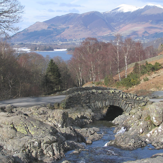
I can see by the trees that this scene is correctly rotated, but the mountains, the bay and the road all slope off to the right and make the scene vaguely disorientating
Post actions
Wow, that's neat. Where is this?
Post actions
At first i didn't care for this image. The longer i looked at it, the more it appealed to me. I like the sharpness of the foreground, and the way the background is soft but still has so much detail. It made me stop and ponder the technique and settings.
Post actions
I think the entire image looks a bit flat. A curv adjustment or adjustments to contrast and saturation might help this a bit. The scene is nice and well composed, just a little flat.
Post actions
good, but it could have been a bit more contrasty, or more punchy insome way. it just seems a little flat.
Post actions
This needs more contrast to help the rocks and bridge stand out more.
Post actions
Post actions
Very nice pleasing scene.....
Post actions
Very nice landscape. It looks in a square crop.
Post actions
This looks so much like the English Lake Disrict, forgive me if I'm wrong. Maybe a boost to the colours would work here well
Post actions
this COULD have worked with more contrast and cropping out that tree in the top left corner
Post actions
This beautiful picture could really benefit from some contrast. It looks washed out.
Post actions
Very pretty, lighting and sat definitely feels wintery. The yellow color on the stones is a little distracting, doesn't seem to belong. Nice comp.
Post actions
Decent shot, but there isn't any depth to the colors. I'd adjust curves or levels to really give it some pop.







 Add photograph to your favorites
 Add photographer to your favorites


 Photographer found comment helpful.


