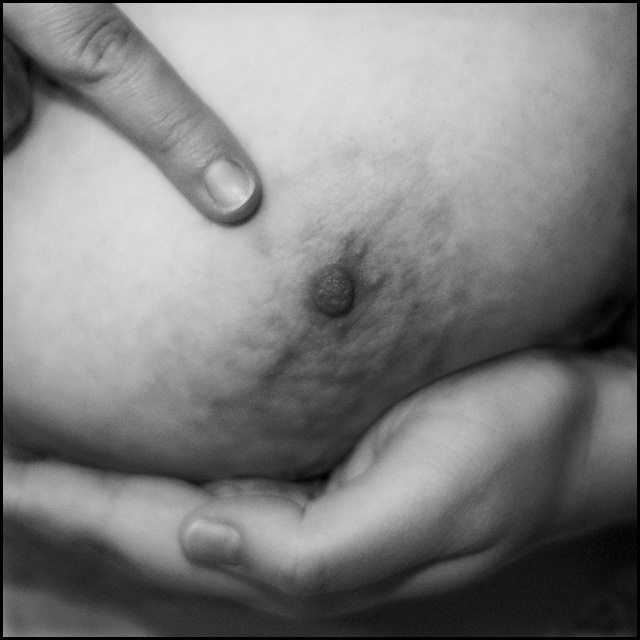
This was the concretization on my original idea since I've readed about this competition. My wife breast. The difficult part was the light, and convince her to pose :)
Shoot with Nikkor 50mm f.18 at f2 1/60 sec. with an sb800 bounced in the wall as fill flash. The focus is a bit off but I think it gains a bit with this difuse/soft focus appearence.
Square crop and converted to b&w in PS, curves and a bit of dodge and burn to emphatize the tridimensional look.
Statistics
Place: 363 out of 369 Avg (all users): 3.7023 Avg (commenters): 4.4000 Avg (participants): 3.5448 Avg (non-participants): 3.9630 Views since voting: 8561 Views during voting: 538 Votes: 215 Comments: 11 Favorites: 0
First Impression - the most important one:`
This is an interesting image. I didn't like it much personally - but that is only personal opinion. Then again the title adds nothing to the image - I don't know a sign woman who points at her nipple in that way and calls it nature.
Composition: The hand cupping the beast worked well the other finger pointing at the nipple did not. I nfact I could not think of a single reason for it to be there apart to state the obcious and most people don't really need that.
Subject: Interesting choice of subject it met the challenge well. It is quite lacking in detail and this may be due to the high level of compression of the image down to 91000 bytes. The Maximum on this site is well above that at 150 kbs
Technical (Colour and light): The lighting is fine - the focus as mentioned by others is a bit too soft - I would almost say out of focus. I am not sure that this image benefited fully from being black and white.
To grow its vote?: Well you didn't get the brown ribbon .. that went right down the toilet - so I think that a sharper focus may help here. Also a more nurturing take on the image of the breast would possibly be a good call.
Summary: Not bad - you have taken a lot of way better shots - but you have taken a concept and worked it through - didn't do great - but you have good advice and voter comment to take on board if you wish to re-try.
If you've got any questions about this critique, please feel free to contact me via the PM system.
The meaning of this image is lost on me. Not that that fact has any reflection in your score. I can't dock you for not understanding. There is a little too much softness and noise I think.
Has a feel almost from the early days of photography - that blurring, and slightly strange focus, and the overall dark-ish but low contrast feel. the pointing finger makes it feel like a comic entry, but the processing works against that.
I think this is a good idea; a breast and hands ought to fit well in a square crop. But these hands don't seem to be expressing female nature. It looks more like someone is holding up a breast in a medical exam and pointing out that something is wrong with the nipple.






 Add photograph to your favorites
 Add photographer to your favorites

 Photographer found comment helpful.


