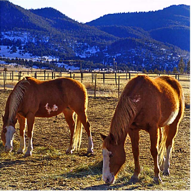
There are some color problems here, esp with the blue shadows in the background and the purple fringing around the white parts of the horse... some selective desat might have helped (or even turning down the saturation generally)
the horse on the left needs a little more room by his head. it makes it look like he is being squeezed into the shot. also the white line around the bottom and right side needs to either go, or continue around the whole shot.
Lovely. I'm afraid the high sat distracts a little though ... masks some of the details. Crop is a little severe on the left horse - but that probably owes to the square restrictions.





 Add photograph to your favorites
 Add photographer to your favorites


 Photographer found comment helpful.


