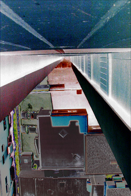
I had to do a small job in this (relatively) tall office building with a semi-balcony area near the stairwell. The colors were really dull, so I tried to give it a more *psychotic* look with curves and unsharp mask. As a last step I flipped it 180 degrees. Although I like it in all four orientations, I decided this was the most disorienting and disturbing, and would thus most closely meet the challenge.
Statistics
Place: 71 out of 110 Avg (all users): 4.3481 Avg (commenters): 5.0476 Avg (participants): 4.5109 Avg (non-participants): 4.2736 Views since voting: 2209 Votes: 293 Comments: 23 Favorites: 0
Thanks, me too! I too this opportunity to review all those comments -- seems more poeple liked this than I seem to remember ... I flipped it to try and give the impression of taking the photo while suspended out in midair away from the wall.
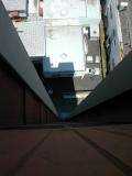
For everyone who wanted to know why I messed with the color so much, here's the bland original (linked from pBase):
The color adjustments were too much for me. they successfully obscured the subject matter to such a point that it's taken me 5 days to figure out the viewer is up high looking down the side of a building to a parking lot. Sorry. Guess I lack vision.
super abstract. i get it but i dont think the invert adds to it. takes me out of feeling the fear of the height and puts me more into a painting ort a surreal reality. then again,i rarely like the look of 'invert'. mag 99
This image is very confusing to me. I think I am looking down I see the tops of parked cars, woow, vertigo, I cant look any more. You are going to explain this photo at the end of the week, arn't you? One of my top picks this week, I think, if my mind will ever stop spinning :-)
Interesting abstract. A bit busy at the bottom...this is supposed to convey 'fear of heights', right? Curious as to what the photo would have looked like without the color manipulation, but I don't know if it would be better or worse.
I'm not a real fan of the neon or solarization effect in this image. Since I can't see the original, I don't know if it adds or detracts from it... = 5 - jmsetzler
This image kinda makes me swimmy-headed. Of course I am terrified of heights so I guess your picture did what it was supposed to. The colors are interesting indeed. karmat
One of the better photos this week. I do like the filter/level or which ever effect it is (you'll have to let me know). I thought of doing something similar - no time though. There is a lot to this image. Great work!! Ruthann







 Add photograph to your favorites
 Add photographer to your favorites



 Photographer found comment helpful.


