It looks like you will be subjected to the second of my critiques in a very short time! Unfortunately this time I do not have any photographers comments to help me see what you were trying to achieve with this shot. Well I'm sure we can come up with some good comments anyways...
This shot begs for me to use the like/don't like format so here goes.
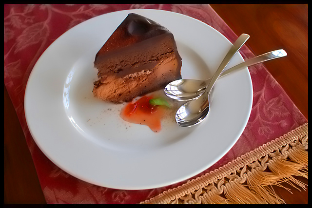
What I like: The overall composition of this shot is very nice. I especially like how the handles of the spoons and the cut of the cake have the same angles. This gives the shot an interesting appearance. I like how you kept the compostion simple also. Everything in the shot appears like it has a place in the shot. There are no elements that look like they don't belong. Nice focus and nice simple color scheme.
What I don't like: The overall appearance of the shot is kinda flat. I think this is because of your lighting. It appears that you used natural light which is good. It appears that the light came from an angle slightly behind the subject which doesn't work so good here. It also looks like the subject was some distance away from the light which means the light wasn't quite strong enough to help pull out the textures of the shot. It's these textures that are important to giving the shot depth. I'm also kind of put off by the angle from which you shot this. You shot from mostly above looking down. This makes for a nice round plate, but looks kind of awkward. If you look at most food shots in magazines or advertisements, they tend to be shot from a lower angle. This tends to be more appealing. Your shot also appears to be a touch soft. With a food item like this, I don't think soft focus really works. It also doesn't go over well with the voters.
Give the shot more light. Shoot from a lower angle. Nice sharp focus. Work on these elements and I think you will see a marked improvements in these types of shot. The cool thing is that this is a shot that you can really practice with (untill you can't stand it and eat the desert anyways!)






 Add photograph to your favorites
 Add photographer to your favorites

 Photographer found comment helpful.


