Author Thread Comments Made During the Challenge
Post actions
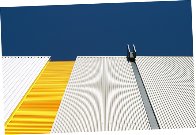
Like the brightness and colors of this one, but the tilt of the photo just doesn't do it for me. Sorry!
Post actions
Great colour contrast and geometry. Contrast between sky and building is good to. I feel the slanted 'frame' is a bit unnecessary.
Post actions
I like the color scheme, but this border is not very good...
Post actions
Nice contrast of white, yellow, gray and deep blue. Is the picture crooked on purpose?
Post actions
actually it's a nice color composition, but i'm confused to see the rotation triangles. Couldn't you crop them away?
Post actions
it took me a while to quote this photo. in my opinion it is so strong as a picture, that the decision not to finish the cropping (you stoppped at turning it, but decided not to crop) is a pitty. But its an opinion, you made a style choice.
Post actions
I guess you forgot to crop your picture ... framed well I think this is a nice picture although I'm not sure it fits the challenge.
Post actions
I like the subject. I love it, in fact, but what's with the slanted edges? I'd give it a 10, but with the border, only a 7.
Post actions
The rotation without cropping looks very strange to me. Otherise a very interesting shot.
Post actions
Great composition and colours
Post actions
I'm not sure what it is, but I like it. Abstract.
Post actions
Don't know if you wanted it that way, but you are allowed to crop out the canvas area after rotating. I really don't get where this fits a trend - the lines moving away? Or is it the use of metal in buildings? Technically a pretty nice photo - colors and lighting are very nice, good focus and sharpness. The lines are sort of interesting.
Post actions
I think you should have cropped after you rotated.
Post actions
I'm guessing you cropped/rotated your photo like that on purpose, but for me it just throws my view off the photo and onto the white space.
Post actions
what's with the tilt? love the angles & the colors though.
Post actions
nice shot. i love the graphic feel of this. the border is a bit distracting though.
Post actions
The weird rotation is quite amusing - if only it didn't look like a mistake quite so much. Intersting shot for all that.
Post actions
It looks like you tried to straighten this but didn't crop. The odd shaped "border" is distracting. Otherwise great colors, and lines.
Post actions
I like the colours here very Mondrian (sp?).. Still not sure I like the border, I can see why you rotated it but I would then have re-cropped.. I admire your bravery.. good luck!
Post actions
Post actions
Different. Not sure what i like about this one, but its simple. Did you tilt the photo on purpose? What is this?
Post actions
I absolutely love the framing and composition on this. The light, color, and cool twist with the frame make this a very fun photo to look at. Nice job! 7
Post actions
Unsure as to why you did the crop like this...? I don' think it adds anything.
Post actions






 Add photograph to your favorites
 Add photographer to your favorites


 Photographer found comment helpful.


