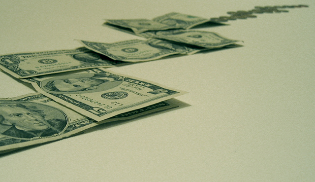
Money (obviously) using an artist's canvas as backdrop. It was a line graph that I was originally going to do from above but I liked this angle better. Fiddled with the color, as I did it without flash and it came out all red-like.
Statistics
Place: 125 out of 169 Avg (all users): 4.6281 Avg (commenters): 5.8750 Avg (participants): 4.2609 Avg (non-participants): 4.8533 Views since voting: 963 Votes: 242 Comments: 9 Favorites: 0
Love the concept! But there are a few technical aspects that could be improved. A level boost would improve the image. I'm not sure if I like the 20 and the corner of the 1 cropped off. Like how the money is dwindling.
Great idea that I think could have been carried out better. For instance, I think the dollars should have been placed so that they go down, and not up. Also, would have liked to have seen a more appropriate background to add additional clues that what we're looking at is a graph and to add visual interest. Maybe graph paper?
Yep, that about covers it! I think a different background color would have given this image more impact. Personally I think the green blends too much. But I like your idea.





 Add photograph to your favorites
 Add photographer to your favorites


 Photographer found comment helpful.


