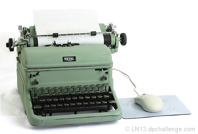
Shot on a table top in my basement through an umbrella on a Sears worklight @ 1000 watts. Custom white balance, and exposure set by using a grey card.
In Photoshop CS2:
-crop
-resize
-on a new layer, masked off the typewriter, mouse and mousepad
-adjusted levels to turn the background whiter
-flattened
-healing brush to remove what remained of the back edge of the table
-dodge a few dark areas of the background
-USM
This is my first attempt at shooting with my umbrella and also my first attempt at more advanced editing. I hope I did well.
Statistics
Place: 7 out of 105 Avg (all users): 6.6230 Avg (commenters): 7.6364 Avg (participants): 6.1967 Avg (non-participants): 6.7650 Views since voting: 2382 Views during voting: 397 Votes: 244 Comments: 32 Favorites: 7 (view)
Meeting the Challenge: I didn't even have to look to see that this was clearly for the Odd couple challenge.
Focus: Dead on. It can't possibly get any better than this.
Color: I like the drab green But I feel that the mouse and pad Could use a bit of color to help it feel even more "modern". The tonal range and colors that are present are all perfect.
Composition: Oce again looks great.
Lighting. This is the only area I can spot any technical aspects that could be improved. I don't like the shado on the left of the typewritter. I think Using another light from the left to remove it would have moved this great shot up another knotch.
Overall: Not a real exciting subject. Or necessarily pretty. This will probably keep this image away from the ilusive ribbon, but I can easily see this as a stock image or a poster. This image make lack in aqppealing to the masses but it is technicaly a spectacular photo.
Keep up the great work!! I look forward to voting on more entries like this one.
Cute idea.. and definately odd. What could that mouse possibly be there for? The paper blends into the white background a bit too much, but it doesn't take away from the idea of the shot. Nicely done!
Great interpretation of the challenge theme and a good shot, although would have benefited from losing the shadow I think. My top scoring image by far, anyhow.
Brilliant idea! I'm not into the high key look, but that won't change my score. I'd prefer it with a very bright mousepad to liven up the very boring color scheme. 8






 Add photograph to your favorites
 Add photographer to your favorites

 Photographer found comment helpful.


