Hi stephan - 'revenge' time? Your critique club moment ...
I think this was one of the more memorable photos from the trends challenge: it doesn't quite make it into my favourites, but very nearly.
I guess you won't be finishing things on that TFT screen again then, huh?
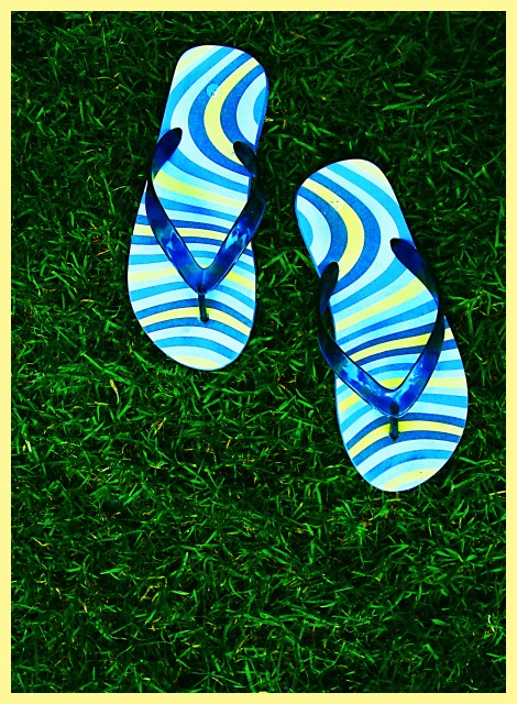
I'm not really sure what I most like about it - it's one of those shots that somehow defies my powers of interpretation. The composition is different: using the thirds but in a vertical manner is an odd thing to do, but effective; the intensity of the grass' green is excellent, especially set against the washed-out look of the flip-flops; the slight progression from dark to light up the image is intersting too - allows a dynamic contrast around the subject and still keeps the background as an important element. I did, and still do, find the border hugely distracting: whether that's just me, but I absolutely loathe coloured borders - they feel like they're cheating my eye, saying 'look at this colour', or 'isn't this clever, I can choose a colour from my picture', or more seriously an attempt to fool the eye into processing the colours of an image differently (in which case why not do that in processing?). I can see the use (and use them myself) of black or white borders to emphasise the overall feel of an image - like being able to choose the colour of wall for your art to hang on, but these coloured tricks ... anyway, drifted off-topic a little there.
48th place isn't so bad, I guess. I think that's because it's a pretty static image - besides the points I've mentioned (and I'm not sure a lot of people appreciate that stuff here), there isn't a lot to it: the lighting is very good, but not immediately eye-catching, the composition isn't orthodox, and it has a feeling of your having over-processed it (where did all the red go?), without producing an effect that will really nail people.
Thank you for the many comments! Never got such controversial comments about my border. One said that it's too pale, and the next comment says it's too prominent. ;-)
Actually I made a mistake. I finished the photo on my laptop which has a problem with the TFT. The colours look much less saturated there and have a blue tint. So the photo actually shouldn't be so oversaturated and also the border should be less yellow.
@miller: I tried to remove the sticker from the sandals, but it was not possible without leaving ugly remains on it.
@mediamst: Actually I like the chaotic look of the grass. It's only the background, the sandals were the subject where I wanted to lead the concentration to.
And I almost forgot: Special thanks to my cousin darksusi! She lent me her beautiful sandals to make this photo possible :)
Good colors and contrast. There are some imperfections on the flip-flops that should have been taken care of before you too the shot, most notably the stickers by the heel. The fact that you have a border doesn't bother me, I'm just not sure that particular color works.
Like the colour saturation: and just about equally dis-like the use of a prominent colour from a photo for its border. So that equals things out :-) Like the way the stripes work together in this arrangement also.
The border seems pale for such an over saturated picture. I think the border should be as bright as the image and let te yellow in the sandals be the only pale color.






 Add photograph to your favorites
 Add photographer to your favorites

 Photographer found comment helpful.


