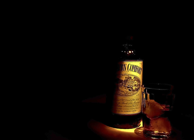
Taken in my kitchen using a flashlight with an orange filter.#880
Post processing: adjusted levels, shadows/highlights, brightness/contrast, changed to sepia, reduced noise, sharpened and resized
Statistics
Place: 88 out of 253 Avg (all users): 5.3303 Avg (commenters): 5.7500 Avg (participants): 5.0241 Avg (non-participants): 5.5185 Views since voting: 1069 Views during voting: 286 Votes: 218 Comments: 14 Favorites: 0
The lighting was a good idea with giving the viewer a little bit to leave to the imagination, but I would have liked to see a little bit more of the bottle for this to be a better image.
For me, the whole picture is too dark and the subject is awkardly placed. The "rocks" portion of the picture is barely visible. It's too bad that the shadow cuts off part of the label on the bottle.
I think this is really close to being at the top .. The lighting is cool ... the problem IMO here but the crop is strange and the detail and ice cubes beg for just a wee more light ... of course monitors are all different so ... Anyway, I like the idea and the lighting but if I were gonna print a poster like that I would add just a bt of content below on this. 6




 Add photograph to your favorites
 Add photographer to your favorites


