Hi, as requested, here is an indepth critique of your submission.
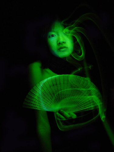
First Impression - the most important one: Interesting image, but not sure green is the best color for it.
Composition: The crop could stand to be a bit tighter, but the composition is not bad for a portrait type image.
Subject: Well defined, we definitely see the subject.
Technical (Color, focus, and light): Color: as I stated in first impression, green may not have been the best color for this image. Green on people, just gives the impression of sickliness.
Focus: Decently sharp. A bit more Unsharp Mask may have helped some.
Light: The important parts of the image are lit, but the lighting becomes a bit flat in the face.
To grow its vote?: Overall, it was a tough competition and a 5.3 is a respectable score. I still have to stick with not using green on people though :-)
Summary: You do some good work, looking at your profile.
The basic concept of this image is very good. The greenish color gives it a "night vision" look. Yours was a valient attempt at the challenge and is proper light painting technique, unlike many, many others.
I tried something similar, though in standard colors, but could not get the light painting the way I wanted it so did not enter. Mine was of a heart shaped pillow given to open heart surgery patients and signed by well wishers. I wanted to light paint to simulate the escape of the human soul should the patient not survive. I just could not get light patterns that "worked". Your image suffers in the same way as mine where the light painted over your attractive model's left eye is more of a distraction than anything else. You got the technique down but this implementation, like mine was, comes up a little short.
You have not taken the chance to maximise the potential of this shot ... making it is maximim size would help wtih this, and allow us to see more of the image.





 Add photograph to your favorites
 Add photographer to your favorites


 Photographer found comment helpful.


