Per your request, here is an in depth critique from the Critique Club.
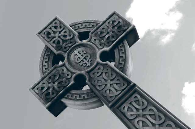
The first thing I notice about your photo is that it seems quite grey. There's a slight patch of cloud in the background that is whiter, but in my opinion it doesn't add anything visually appealing to the photo at all.
Focus seems ok, Nice detail in the artwork on the cross.
I think the background hurts the image. The little puffs of clouds are just enough to distract from the image and not add to it. The one closest to the cross is also a bit blown out.
I'm not really sure that the duotone treatment adds to the image either, but i'm sure it doesn't ruin the image either. So maybe it really wouldn't matter either way? I'm trying to imagine this with 'color' and can't imagine that there would be much color in the original to make it interesting anyway.
Overall, neat subject, would have preferred a different background.
~Heather~
the stone looks nicely lit and textured but I don't think the composition is a happy one; the angle is somehow wrong and the clouds are not framing the image in a studied way; to get that look "from bellow" some more perspective distortion should have been visible on the cross; or level straight view would have been appealing too





 Add photograph to your favorites
 Add photographer to your favorites


 Photographer found comment helpful.


