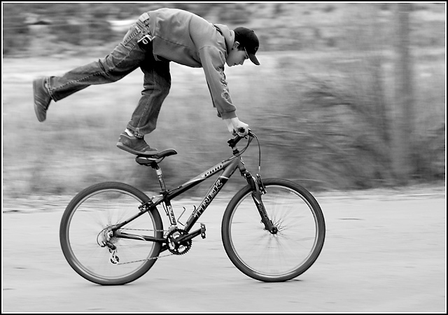
this is the most amazing shot ... just love those negative spaces created by the bike and the legs and even his face and cap ..... love your b&w treatment .... perfect .. & 67 out'v 608 aint bad !!...:)
First off, let me congratulate you at a new personal best, at least for now, I am very confident you can get a 6+ and soon too. I hadn´t even discovered photography when I was 16 so keep that in mind, you are lightyears better now than I was when I was 16 :) Keep at it dude!
I generally like this photo, I didn´t vote but would probably have given it a 6. I like the motion panning, just enough to blur out the backround but still keeping the bike and boy almost pristine sharp, I like that the rods in the wheels are blurred out (sorry, don´t know what they are called in english) I think this is an excellent choice to make black and white, I don´t think I would have liked this shot as well if it had been in colour. I am a big sucker for heavy contrasted b/w right now and this is perhaps a little bit too flat for my taste but it´s nothing that is bothering me, just a personal preference.
Regarding the composition, I feel it´s a little bit cramped towards the top, you almost cut off part of the boy so I think it would have been better to have slightly more room to the top and a little less at the bottom. I see you said you cropped this, if you have any more space at the top I would love to see a version like that.
As for meeting the challenge, it certainly does so in my eyes but I think (not sure so take this with a grain of salt) that technically "Duotone" means b/w with some other colour, like sepia toned, or blue toned and such. While I would have voted it as meeting the challenge and I think that most people did since the challenge description specifically named b/w, I still think that a couple of people must have voted it with 1, 2 and 3 votes because it´s not a true duotone. Anyway, a huge challenge and you ended up in the top 10% so that´s pretty well done, now keep at it :)
Gee, that looks scary. Kids ;) Really like the shot, great panning, nice tonal range. Wonder though what this would look like in color. Better or worse? Hard to tell without the comparison.
this might have won the panning challenge ... That's probably what 87% of the voters are thinking!!! Compositionally it could be a little stronger but I enjoy looking at it. 7





 Add photograph to your favorites
 Add photographer to your favorites

 Photographer found comment helpful.


