Color..... umm I guess this catagory is a bit poinless in this photo.
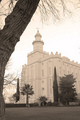
Focus: I like it nice and crisp lines everywhere. The road, the church, the tress all in perfect focus.. This alone wins a few points in my book.
Contrast: I see that most think this could have used a bit more contrast. I agree with them to an extent. I like the monotone and gey feel of this image. But it does feel a little flat. I think a little burning would make everyone hapy. Maybe burn the sky a little to bring out the clouds a bit more. And just a light pass with the burn tool over the trees to give this more depth using dark to ligh with a midline.
Composition: I like it.. Rule of thids was used. It has a nice balance and natural feel. I even like the border.
Overall I voted this image pretty high. I gave it a 7 during the challenge. I think with a little use of the burn tool this could have easily received an even higher score. Wonderfull photo.. I look foerward to seeing what you come up with next..
White point seems just a hair too bright (see church steeple and door seem to lose detail). I think you could have kept just the smallest amount of detail in your lightest details to pickup another point from what I'm seeing. 6






 Add photograph to your favorites
 Add photographer to your favorites

 Photographer found comment helpful.


