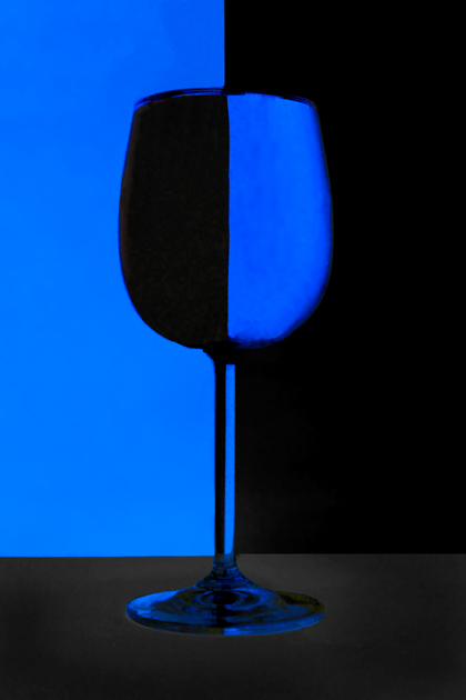
I did alot of editing on this one. Levels, Rotate crop. Then I did alot of minor clonmning to rid of the glare. Than I inversed the colors, and adjusted the levels, selective coloring, and hue/sat a bunch. Finished with multutudes of selective gaussian blurs in order to rid the noise.
Statistics
Place: 408 out of 631 Avg (all users): 4.9007 Avg (commenters): 5.7500 Avg (participants): 4.6557 Avg (non-participants): 5.3119 Views since voting: 812 Views during voting: 405 Votes: 292 Comments: 10 Favorites: 1 (view)
I've always liked this type of shot. And having tried it myself, I know how difficult it is to achieve. This is a very respectable take on it. I like the colors, although the blue seems to glow just a bit too much for my liking. The image is sharp and the centered composition works here because of the subject.
On the down side, I see three colors - blue, black, and dark grey. I suppose it could be argued that dark grey is just a tone of black, but in a specific duotone challenge, this may have hurt your score a bit. Also, the grey of the base makes the image seem just a little ... "off". The best photoshop is photoshop that can't be detected, and this particular part is a little too obvious, in my opinion.
Yes it is at dpc but you appear to have taken a slightly different approach to othe examples I have seen. The base of the glass appears to be suspended in mid air. I am guessing you have inverted the photograph. Either way, I really like the effect & its so good to see a bit more colour than shades of B&W
It is a cliche indeed :) someday I have to shoot one of those :) seriously now: there's a strange look about the glass base, the rest has nice contrast
Yep it is a cliché, the edges seem a little too fuzzy to get that wow factor, still like these images though :) I know I'm going to surcome and give a go one of these days






 Add photograph to your favorites
 Add photographer to your favorites

 Photographer found comment helpful.


