If you didn't find any of the other 20+ comments you received as helpful, I'm not sure if I will be able to add anything as I do agree with some of the previous comments, but I'll try.
Per your request, your in depth critique from the Critique Club...
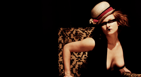
The very first thing I notice about the photo is the chest. The way the shirt blends right in with the black background, it makes the chest seem malformed, or something. The shadow in the cleavage area also looks odd making the chest seem to have indents that seem very unnatural.
The shadow from the head on the upper chest is distracting, and I would have added some kind of side light or something to help reduce those harsh shadows.
The black background works except for the fact that the shirt blends in with it too well, maybe have a different color shirt?
The pattern on the chair makes the photo look too busy to me. The floralish pattern really clashes with the dotted pattern on the hat.
Focus seems ok, maybe just alittle soft, but nothing that seriously harms the photo in that aspect.
The pose seems awkward, like she is sitting on a cactus and although the cactus is there, she really wants to sit down anyway, but just can't.
I think I would have prefered the negative space to be in front of the model. Model and chair on the left of the photo...neg space to the right. As is, the negative space isn't really adding anything to the photo.
I don't think I like the makeup, but for the purpose of fashion, I think it fits. The hat is interesting and I like the 'fashion' aspect of the photo. So it fits the challenge very well.
~Heather~
One of my favorites in this challange. I would like to have seen this one with a square crop. A bit more black on the top and a bit less on the left. Great picture! Congrats. I'm thinking top 5.
I keep coming back to this image.... I love the makeup in the shot! Very modern! I think what bothers me a little is the pattern of the chair and the hat clash. Plus her pose seems a bit uncomfy. But there is something about that I really like. 7
very nice. Has a "Clockwork Orange" feel. The softer focus helps your image, while it hurt some others. Great use of negative space. Body position, and neg space to left, makes it feel as though she is about to be gone. Also, nice model... so excuse me while I go parental block the site from my son.





 Add photograph to your favorites
 Add photographer to your favorites


