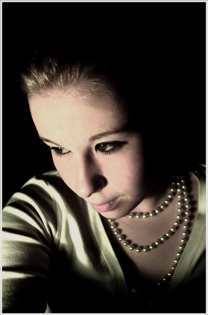
This is the 3 photo i submited for this challenge, hoping its the charm :) I like it, hoping that it dose well, been asking people what they think and the word on the street is that it's better then the other two i had.. at least thats something :)yeah by the way the model is I as some people might have seen :) and yes i know the lightings hars, just dont cear :)
IF YOU ARE READING THIS.. COMMENT PLEASE!!
Statistics
Place: 67 out of 133 Avg (all users): 5.1264 Avg (commenters): 6.1111 Avg (participants): 4.6032 Avg (non-participants): 5.2359 Views since voting: 1560 Views during voting: 485 Votes: 364 Comments: 19 Favorites: 1 (view)
I like the light and shade in this portrait. I also like the effect of the pearl as they really sparkle.
I am not going to give any negitive comments, as many have done this.
My last impression is that I think this is one of your better images in your portfolio, so keep up the good work.....
I thought that this would score higher than it did. The only things I can recommend is that the tones seem kind of flat and not interesting. The lighting also seems to be too harsh from the left side. Other than that, great job!
I'm surprised that this is your lower-rated entry, as I like it the best. The lighting on her face is a bit too harsh, as are some of the shadows on her arm, IMO, but otherwise, I think it's a great portrait. The pose is good, the 50s look is there, and the way she fades into the dark background gives it a neat feel. Had I voted, I would have given it a 6-7, although with a little work in Photoshop to un-harshen (is that a word?) it, it would have been an 8 or better shot.
Good luck in the future and keep shooting!
I really like the idea of this shot. The pearls are beautifully lit, although I do think the lighting on the face is a bit much. It's still a very nice shot with creative pose and idea.
Comments without reading the others comments: Like it. The light is very dramatic, in some little areas too much for me, but the overall photo is quite good IMO. Your expression is superb and the reflects on the pearls add a lot to the shot. Very well done.
Great necklace, and I like the pose. I think there might be a bit too much negative space at the top... and maybe just slightly angling your head up a bit more might have been nice. You have a consistent style in the photos here on DPC... I look forward to seeing how it develops.
Hi! This is an amazing shot and I'm really surprised it didn't do better. I love the lighting, the colors, the whole set up is very well done. I'm guessing what hurt you in the end is coloration. I think it works well for this period that you are representing but I'm betting others found it a bit off because it's not "in you face" colors, more muted. Also, a slightly tighter crop on the left side might bring a better balance to the shot, leaving the negative space on the right and top. Otherwise, I wouldn't change a thing! :)
Oh, one more thing, don't know about red lipstick, but a slightly brighter or maybe a little darker color might have helped just a bit.
I agree on the cropping suggestion, I say that this pic is MUCH better with a crop right down to the hairline.
The "harsh" lighting is what drew me to the picture. I believe the correct term is actually "Dramatic". ;)
What has happened here with the colors is fantastic. The subtle muting of everything is very beautiful. I can still tell that she is a blonde.
I almost wonder if perhaps she has green eyes to match? I can't really tell. That would be the one thing that I would seek to work on. Is it possible to bump the greens just a hair? Play with the color channels just a bit. You don't want to love the soft coloring, but if there was a way to bring out the color in her eyes....
I don't agree that red lipstick would have made this photo. I like it very much just as it is.
On the subject of the Challenge though, it looks like the pearls have lost the center of attention for the pic. Tough call as this really works as a portrait. Don't know what it would look like if you increased the DOF to get those pearls...
I would have given it a 9 or 10 had I been voting.
Composition: 6
Technical: 3 - the pearls are not in focus
Creativity: 5
Appeal: 6
Challenge: 5
Overall Score: 5 - (weighted - NOT a calculated average)
Dark tones, looking off and harsh single light source make this an excelent "grunge" style image. Not the best way to display pears or fashon, but I still like the image very much and it carries a youthful appeal.





 Add photograph to your favorites
 Add photographer to your favorites

 Photographer found comment helpful.


