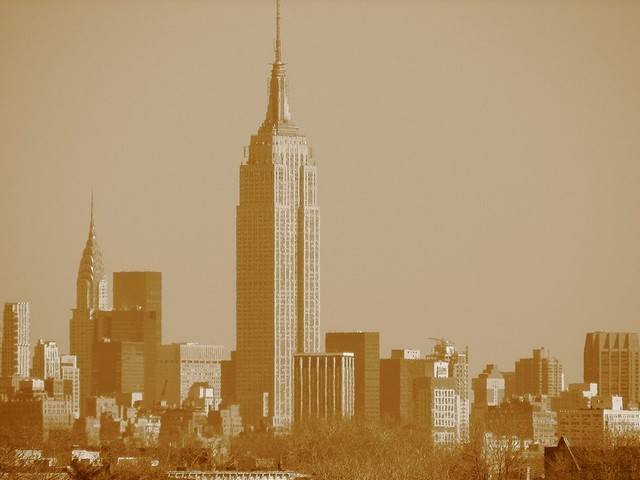
I like the shot, there's a lot to look at, perhaps too much to look at. It's hard to get the top of the building as well as the surrounding buildings. The main subject is off center which is good, but the fact that it's cut off at the top takes away a little. The bottom 10% doesn't really show too much, so perhaps it would have worked better including the top of the building while at the same time cutting off just a bit at the bottom (not too much, though).
I agree with the other commentors that the image needs some more contrast. As is, everything looks washed out, or maybe faded is a better word. I like the toning, but keep in mind when it comes to sepia toning, different people like different things.
Image lacks contrast. I like the duotone you used, but I think it makes it difficult to really contrast when you have lots of details. I like the subject matter, and the composition is great.







 Add photograph to your favorites
 Add photographer to your favorites


