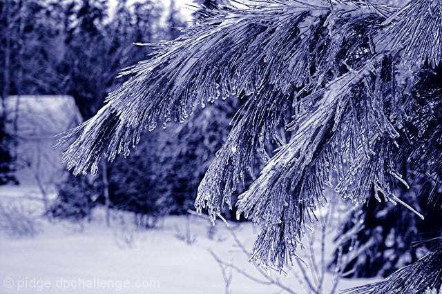
I didn't see this one in voting. I like the blue duotone. Blue was hard. I commented on another that it made the sky look artificial, but here we don't have to deal with that so it works. Obviously you were trying to convey the chilly aspect of the picture. The 5.38 is not a bad score really. I think it reflects the technical soundness of the shot. Your contrast is well done; the lighting is good; and so is the composition. Ultimately, the subject probably just lacks that oomph to transport us somewhere else.
I'm not the best to comment on sharpness as my 1900x1200 screen tends to make oversharp pictures look ok. That being said, I do wonder if there is a little oversharp action going on here. If others made the comment, I'd believe it.
This is my two cents...if you would have moved over two more inches to the left, you would not have that block of snow. Because I do think it distracts from the photo.
I hope you see my comment as constructive and helpful in your pursuit to improve your photos ;)
So let's get on with the show ;) You seem to have a fond affinity with ice these days ;) The image in itself is quite plain eventhough textures and layers abound throughout the composition. I have seen your other ice images and by far they stand out more than this image. The purple duotone used on this image doesn't lead me to think of cold harsh winters. Maybe a blueish tint would have been more effective. A close up view would have been more effective as well. The bokeh is nice but I think the bokeh would scream and sing out loud had this been a closer study of one of the leaves ;)
In my opinion, this should have scored higher, but my knowledge is not good enough to explain why it didn't. If I could see a fault I would certainly tell you, but it looks well composed, great use of colour, only thing might be the building in the background is a little distracting, but not enough to warrant a 5.384 IMO. I didn't get as far as voting on this image but if I had I'd have given a 7 or 8.






 Add photograph to your favorites
 Add photographer to your favorites

 Photographer found comment helpful.


