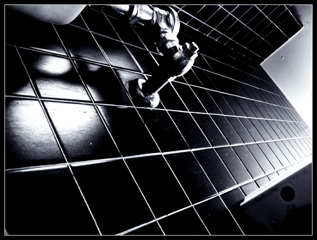
why did i choose this picture, why did i want to lie on the floor of our bathroom, damp mats soaking into my hair, staring at the sky and the underside of the sink, my arm wrapped around sweating cold porcelean, counting the lines on the wall. the lines on the wall. right? why.
----
The bathroom I share with my suite. In retrospect, I wish I had draped something over the window to block out that glare. No, it's not a urinal, it's just a regular toilet, and the underside of a sink.
Thanks for looking, voting, commenting.
Statistics
Place: 410 out of 631 Avg (all users): 4.8912 Avg (commenters): 6.6667 Avg (participants): 4.7622 Avg (non-participants): 5.1101 Views since voting: 983 Views during voting: 384 Votes: 294 Comments: 12 Favorites: 0
Hello Vincent and Greetings from the Critique Club!
You've gotten a lot of great feedback on this photo already (not sure why you've asked for a critiqe as there's not much more to comment on??)
I was one of the "5" votes so I saw this as a solid but "average" shot. I agree with the hot spot being a detraction. Placement of the lines and the metal thing worked to strengthen the composition. Good choice of B&W as the two tones. Good eye on selecting a view that translates well into two tones. Grainy, oof works because it compliments the dizzy angle.
There wasn't much interest on my part on the elements or subject so that didn't give me much to stop and study.
Please pm me if you have questions. Keep shooting and entering :)
Gave it a six because I like lines and it was technically fine. :) Other than that, I didn't really get the point of it; I imagine a lot of people felt the same.
Shooting out of the box is fantastic. Just don't expect the results to do well at this particular site unless you're an absolute PS whiz, popular enough to have a "following", or extremely lucky...
I think this is an example of a picture where the title hurt you. It was confusing to me when I saw this and I'm pretty sure confusion is not a good thing. The picture itself is interesting and creative. I like the lines and their diagonal slant which is quite dynamic. The highlights aren't too problematic as the picture is generally high contrast anyway. The perspective is an unsual one and that gives the picture interest. Ultimately though, it doesn't lead to much. The picture would be much stronger if the lines led to a subject the eye could behold. Technicals are good. The flecks are a bit distracting and you may have been able to remove them in basic with "dust & scratches", but you have to see what it does to the rest of your picture...






 Add photograph to your favorites
 Add photographer to your favorites

 Photographer found comment helpful.


