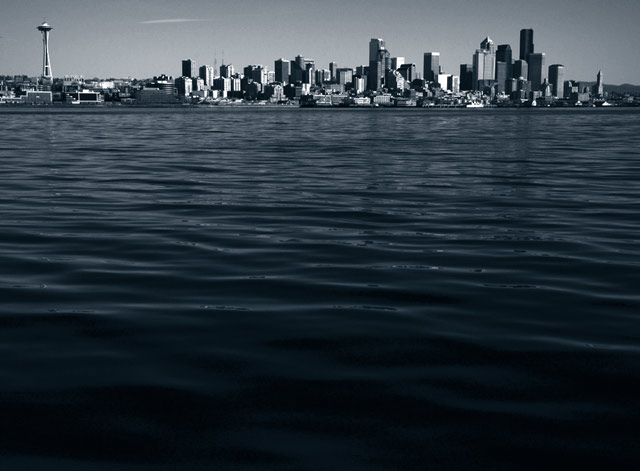
Too much wasted space at the bottom of the photo. Remember the Rule of Thirds! This critique is not meant to hurt your fragile feelings but rather to help you become a better photographer. Besides, this is just my opinion.
Fun, although I think you've crowded the top of frame just a touch too much. I'm not sure that the separation of the leftmost tower has helped you at all - the shot would be simpler, and perhsp the better for it in dpc terms (at least), cropped to exclude it. Sure that's a Seattle landmark, but this image's impact is not about where it is, particularly. Now I mention that, I'm not sure oit wouldn't be stronger for being the more anonymous. Interesting stuff though, thanks.
Interesting concept. Might have had more impact had the waters been calmer and the reflection more obvious. I do like the sharp detailsed in the cityscape, and the tones you used look great.





 Add photograph to your favorites
 Add photographer to your favorites


 Photographer found comment helpful.


