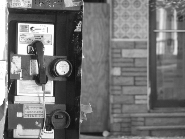
Would've had a little more contrast, just so the detail in the booth itself stood out a little more, IMO. But overall a good shot, I like the way the background blends so the patterns don't draw too much of your attention away from the booth.
"Payphone in Newark, NJ" does defiantly fall within the Duotones challenge. One thing that is great is I do believe this was the only phone as opposed to when you see the same shot over and over.
The image itself is interesting and look like something on a book cover or the news. I really like that our focus in on the phone and how soft this makes the background look. I don't mind that it look like horizontally the box is leaning but I think it may have scored a little higher with the vertical being straightened, but maybe that is what you were trying to achieve. This challenge was so huge I think it is really hard for voters to go through and give the time they would want to, to each piece. Also even though we were looking a Duotones I think people were also looking for something is very striking and possibly more contrast. This is really a great first challenge entry and I am sure we will see many things to come from you. Keep up the good work.
Well, the contrast is nice on the image. The patterns in the background give it a bit of a tonal range. I found the image to be kind of boring, though. Just want to encourage you to think about what you are shooting, and asking yourself if it is interesting to a large amount of folks.





 Add photograph to your favorites
 Add photographer to your favorites


 Photographer found comment helpful.


