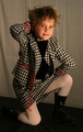
I like the framing and the directness of the model's gaze. The skin tone is pretty good but the highlights seem over exposed. I might try shooting from a slightly higher angle, just to see what it looks like. Some light on the back drop would lessen the shadow on the right. I like your choice of overall tint.
This isn't tres chic, if you'll forgive the bluntness. This looks more like a glamour or vanity portrait than something I'd see in a fashion magazine, and unfortunately for this attractive woman, not a very good one. I could have done without the duotone. The model needs to be placed furthur away from the background to avoid the 'big hair' effect created by dark shadow directly behind her. Her skin tones are quite washed out do to overexposure. Try again, keeping her placement in relation to her background in mind and filtering the flash a bit with some wax paper taped over it.
Composition: 3 - head too close to background, bad shadow
Technical: 5
Creativity: 5
Appeal: 5
Challenge: 5
Overall Score: 5 - (weighted - NOT a calculated average)
Don't care for the reddish cast to the pic. The lighting is very harsh and not at all flattering. Not sure I can really see a connection to 'fashion'. It's an ok prtrait, but I just can't quite make the connection to the challenge.
A very pretty girl. Nice facial structure. Nice hair style. The eyes are deep and expressive. Not sure what is actually the fashion being portrayed though. Could be the hair style. I do see this in a beauty salon on the wall, so that is what I will venture to go with here. I don't get the title. I don't speak in other languages other than English..LOL.but I gave this an 8. Nice over all photo.







 Add photograph to your favorites
 Add photographer to your favorites


 Photographer found comment helpful.


