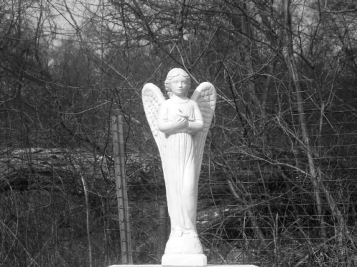
the composition is not too much.. maybe you should have used that fence and dryed boughs to convey some sad feeling, (maybe looking at the angel through them?) this way it just looks like an ugly background to an object slap center in the photo
This doesn't work to move me much. I hope I see something that inspired you to try a duotone image but it seems like it could as equally as well have been an image you shot that you just chose to try converting.
The shot seems awfully busy which detracts from your subject. A shallower depth of field would have helped the photo some (smaller f-stop will give you a shallower depth of field and more blur on the background). The fence post is slightly tilted which seems to be complimentary to the statue's outline but with the horizontal lines of the statue base and the fence it just comes off as tilted and it is reinforced by the vertical branch on the far right side of the photo that is leaning at a similar angle.






 Add photograph to your favorites
 Add photographer to your favorites


 Photographer found comment helpful.


