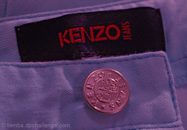
Have been away and didn't get a chance to shoot anything for this challenge. Duotone is so over subscribed I really didn't want to get into that so spent some time this evening playing around with some of my clothing. They may be Kenzo jeans, but they were bought at an outlet shop - designer is not really me!
Croppped, levels, selective colour adjustment and USM in post processing.
Statistics
Place: 114 out of 133 Avg (all users): 4.3159 Avg (commenters): 3.4000 Avg (participants): 3.9841 Avg (non-participants): 4.3854 Views since voting: 824 Views during voting: 453 Votes: 364 Comments: 6 Favorites: 0
I think some of the other commenters here have hit on some key points. One of the first things I noticed was that the button was out of focus, I only noticed the focused label afterwards. The pinkish tint seems out of place and the lighting is nothing really spectacular. Perhaps a more dramatic lighting would help? The shot is also very straight, with the label and the button lined up neatly down the center. I might have tried turning this one about 45 degrees, putting the label and the button in positions that lined up more with the rule of thirds. Hope this is helpful!
I'm not sure that this meets the 'spirit' of the challenge, but since it technically does, I'll let that pass without marking off for it. However, if I were a fashion magazine editor, I would have to take a 'pass' on using this photo for a couple of reasons. 1- While close-ups or macros do indeed appear in some designer ads, they are always crisp and clear throughout the entire picture. 2 - When these close-ups appear, they are usually shown 'in context' (a cuff on a model's arm, for example). 3 - The composition is visually boring. There is nothing that leads the eye from one spot to another in the photo; the eye simply jumps around trying to make sense of it.
Also, I don't know if this is the actual color of the item. It _looks_ like it was added in post processing. So, again, if the color was added after the fact, this would be another cause to not use the photo.
I know that this isn't a very positive critique, but I hope at least some of it will be helpful to you.







 Add photograph to your favorites
 Add photographer to your favorites

 Photographer found comment helpful.


