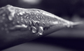
I see you enjoy impressionism. This photo is a study in light and fractured bits that make up the whole (similar in that way). Congrats on the honor of the "favorite"
I socred this one above average as I think you've captured a unique view - an abstract in two-tones. I agree with another commenters -- adjusting the levels my have improved the light play. As for the color tones - a blue would have sent a stronger "icy" message. The warmer tones leaves the image ambiguous (flower/ice crystals) and therefore more is asked of the viewer.
As for the lower ranking (although 5.11 is nothing to cry about) I can only speculate that since the focus is soft, the image abstract, and no color to direct the eye, one might see this as a photograph with no main subject.
Please pm me if you have any questions. I enjoyed looking through your entries and hope to see more in the future.
5 - Have looked at this for a while and cannot decipher if it is ice formations on a window or some type of floral arrangement/foliage. Hoping it is the first, will be back PC to see. If it is the first - my 'criticism' is that I'd like to see more definition/sharper and perhaps the toning tweaked more to enhance the tonal ranges. Possibly also either more of a square frame, or else vertical may have helped this. Also, don't understand how that bottom left area could be black/blue after this image was converted to sepia/duotone. Again, will be back PC to see. Like the potential. Again, if this is some type of ice formation, perhaps a blueish tone may have enhanced it further as well (or even the illusion if this is foliage) - but your call obviously on the choice of color.






 Add photograph to your favorites
 Add photographer to your favorites

 Photographer found comment helpful.


