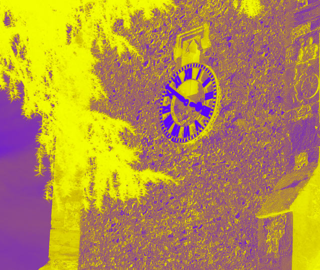
I think the feedback that jhonan provided hit on some of the key points as to why this scored so low. A few degrees of rotation would help this shot, especially in this type of color scheme. I also agree that this color scheme was a bit too out of the box for the dpc voting crowd. As jhonan pointed out, you've made almost a negative of your original by using the light colors in dark places and vice versa and to combine that with the bright and contrasting colors, probably gave many voters a poor initial reaction. I think you have managed to capture some interesting textures in the building and surrounding items which would have made for a great duotone in the more traditional colors. Hope this is helpful!
In the forums you asked for some extra feedback, so here goes. I can see two major technical problems here;
1) It doesn't look straight. The wall on the left hand side looks tilted.
2) The colours. Okay, perhaps not a technical problem exactly, but the combination of yellow and purple is just too jarring. If you look at the number of 1's you were voted on this, I'd say it was the colour combination that put most people off.
The post-processing looks as if it's been overdone. It makes the image look like a negative (the shadows are more highlighted than the highlights). The subject is reasonably interesting, but if I was to be a real perfectionist, I'd say it was 3.51pm and not 3.50pm :)
I don't vote on contests I've entered, but I wish to express my congratulations and condolences for being another outside-the-box thinker and using two colors for your duotone. A wild, abstract picture that really shines over a B&W conversion. I'm giving you a 10, but alas it won't stick.
This is a two-color image but that doesn't make it a duotone. The second ink color in a duotone is used to enhance the first, not to show some objects in one color and other in another color.






 Add photograph to your favorites
 Add photographer to your favorites

 Photographer found comment helpful.


