I am sooo glad that a few of my photos had the correct date stamp. I'm not sure how this will do in a field of many. I think this will top 600 entries. Just wanting to finish above a 6 as always ;)
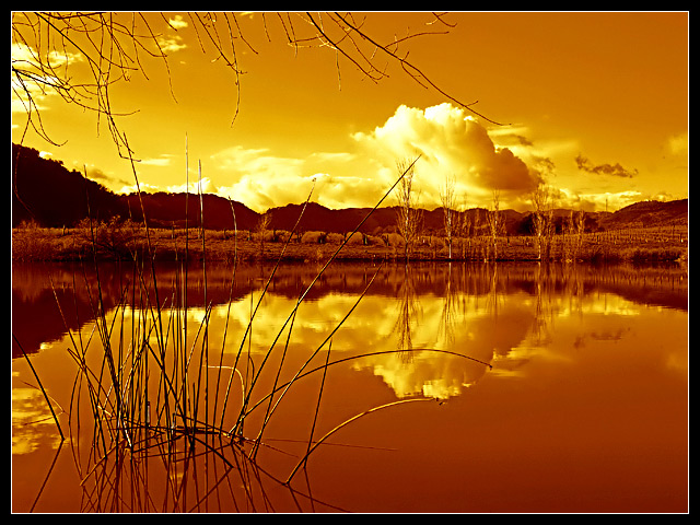
Shot in RAW and processed with RSE. Lowered Color Temperature to 4100 with a -1 Tint. Outdoor Strong appearance with a 100% Saturation boost. Hue at -16 with a -11 Sharpness value. 50% Detail Extraction with a 100% Noise Suppression.
Damn sensor dust in Basic! Arrrgh!
Challenge log: I am Entry number 619
IMG_1946.CR2
------------------------
Post Challenge:
Woohoo! I never expected to finish this high! Wow! I am stunned. I know I received a lot of comments about the branches being distracting. I know I completely agree but with Basic Editing, I couldn't really do much.
Here is an outtake that I would have done had this been in Advanced editing. I also realized how bright the image is. I guess my monitor at work isn't calibrated properly.
Some folks have commented about the artifacting of the reeds in the foreground. It's touch not to due the the fact that these types of reeds are the ones that are segmented so even at a 100% crop, they are still jaggy ;(
Thanks for all the votes and comments ;)
Disqualification Details
Any attempts to alter the point totals in any way for any photograph will result in immediate loss of account and a ban from the site. Photographs by any participating parties may also be removed from past or current challenges.
Statistics
Views since voting: 2781 Views during voting: 519 Comments: 54 Favorites: 6 (view)
I missed this challenge - congrats on your top 10 finish! Beautiful image. You really are partial to orange tones, aren't you? :-) This works really well. So smooth - fantastic reflection. Very nice.
Rikki, I've been looking through your challenge submissions and I have to say I am impressed at how much you have improved in a relatively short period of time. You get some big kudos from me dude.
Hi, Kari from the critique club, I can making this painful but hell top ten ... what can I say!
First Impression - the most important one: Wow ... awesome colour for a duotone where everyone was saying that black and white and speia are going to make it.
Composition: Lovely I love the crop here. The twigs at the top and the bottom lead the eye perfectly to the right side fo the picture and the reflections add to the story being told.
Subject: Two colours .. duotone ... meets the challenge well.
Technical (Colour and light): Beautiful ... beautiful ... beautful ... what a place to be able to go to and see in natural colours ....
To grow its vote?: Shit I don't know ..really less than .1 between you and fifth .. I know that annoyed me when it happened ... but not alot I could do ... you already know plenty about ribboning anyway .. what advice you got for me? :)
Summary: Great picture great colours .. and neat perspective .. well done.
Hmmm, I really like this for the most part. I like the grass in the foreground, I just wish the branches in the upper-left had not been included - I really feel that they detract from the overall image.
I like this. Must be a bright orange over black??? Almost seems there is something else going on. Maybe a very dark red with the orange. Anyway, nice picture with interest throughout. Good luck.
I'm not sure I like the title, but an excellent shot. Duotones with lots of negative or blank space seem to be doing the best with my voting. I like the strong orange tones and the foreground subject. Wish the upper branches could be gone. 8
Well, at first glance this picture looks really nice, but I think there is way too much post-processing too me. I can easily see the pixel in the reflection section. Also, I am not sure the picture fits well to the challenge.
That's bright. I like the reeds and their reflection. Also the tree branches hanging into the frame. The still water and the reflections draw my attention to that cloud. This works for me.
Two things really hurt this image. The clipped highlights and the oversharpening. Other than that this is really good. The color, detail and contrast are great.
Beautiful duotone colour, one of the best in the challenge, the tone and the balance is spot on, the grasses in the water look strange though, slightly pixelated or something that is a little distracting (is it oversharpening). The branches above could help frame the photo but in this case they feel a little distracting
Orange tones make this very different than the other entries I've voted on thus far. I like it! The only distraction to me, is the branches in the upper left portion of the frame. I would love to see and edit of this shot without those in it. The reeds jutting out of the water are a great primary subject that helps move the eye over to the reflection of the clouds and through the rest of the shot. Well done.
I love how you chose a bold orange for this photograph. The actual cloud has the shade of white that's needed and the reeds in the foreground have that dark touch that's needed. Great composition all together. Good job!
This is nice, but I'll bet the sunset looked even better in colour, so why spoil it by converting to sepia? Still gave you a good score for the quality of the image.





 Add photograph to your favorites
 Add photographer to your favorites


 Photographer found comment helpful.


