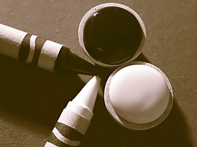
Took a black crayola, a white crayola, a tube of Sequin Black paint, a tube of Vintage White paint, two small wooden craft bowls, and a sheet of grey paper. Used a 1000watt halogen work lamp, turned off all the lights, and started experimenting.
Post-processing: added an adjustment layer (Channel Mixer) to the duplicated layer; checked monochrome, and set it to Red-0, Green-50, Blue-50; changed image mode to grayscale; changed image mode to duotone; sharpened; ran through NeatImage; resized for web
Statistics
Place: 377 out of 631 Avg (all users): 5.0211 Avg (commenters): 6.4545 Avg (participants): 4.8125 Avg (non-participants): 5.3578 Views since voting: 854 Views during voting: 364 Votes: 285 Comments: 14 Favorites: 0
Unlike some of the earlier comments, I think the contrast and coloring is spot on. It looks like a nice classic photo without over accentuated contrast or ... well saturation doesn't make sense in this challenge, but those two values tend to be tweaked too high to my liking on this site.
Great exposure. You kept the details and tones throughout the ranges. You're light tones aren't blown out and the dark ones retain details, too. Very nice work. Composition doesn't set me afire but it does show some action and interest. Creative idea and well-executed. 9
There's not enough contrast between the black and white to my taste. I would also have looked for a way to separate the background into a lighted and a shaded part.






 Add photograph to your favorites
 Add photographer to your favorites

 Photographer found comment helpful.


