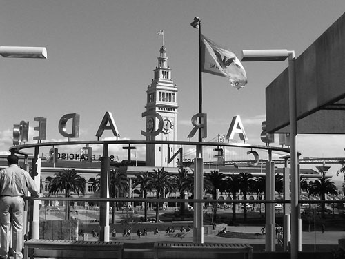
Just a small tweak of the measure tool and this image would be improved by a level horizon line, say ,,, level the line between the (left) A and the R. The contrast is good, composition needs work, too bad the guy is cut off.
This reminds me of a vacation snapshot. I was not very inspired by it. The light on the left looks like it's floating. I think I would have cropped it a bit differntly. But I am by far no expert. Just my opinion.
It seems busy to me and I think that leads me to look for a little more contrast to try and separate some element out. The tones seem to be handled well but I just can't get away from the quantity and pervasiveness of the elements that compete in this shot.
I don't really know what to look at in this photo, there is too much going on. A random man, a light floating in the air on the left, a backward sign and flag that I can't quite read, the tower and part of a roof. The tone is good in this picture, I just wish I could concentrate on one thing!!






 Add photograph to your favorites
 Add photographer to your favorites


 Photographer found comment helpful.
