This is an easy critique, because there's not much I would change about this photo!
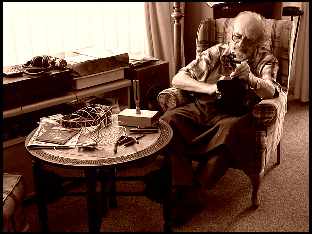
Aesthetics: I think the tones are good, and well chosen. The scene is good, and interesting. Composition is also very good. A couple of things are not as strong as they could be: with the lighting and point of view as is, I found it harder to recognize what he was doing. Also, the bright side lighting source being visible, also distracts from the subject. Cover it with your hand and see how much stronger the subject becomes.
Technical: Sharpness is good, as is most of the lighting. There seem to be a few small hot spots on his face and arm, but they are not significant.
Beautiful, assured work. The light is perfect, and the connection created between the man and the table with the simple tools of his trade is masterful. 9.
If only you could have put more light on the violin. It is a major part of the composition, but it doesn't show up enough. think it would have been at least in the top 20 if that violin just showed up better. 7
Really nice looking photo. Love the duotone, composition and tonal range. The only negative for me is the harsh highlights in the window which breaks up the mood some what.
i love how you captured this setting and the natural-looking subject. the sepia complements it also. however, the overexposed shades from the bright light can be a little distracting...
I'm digging the feel of this picture. My only minor complaint is how it seems like there's something missing at the far right side of the composition (around and in front of the arm-chair). Sepia is utilized perfectly nevertheless.





 Add photograph to your favorites
 Add photographer to your favorites


 Photographer found comment helpful.


