Author Thread
Post actions
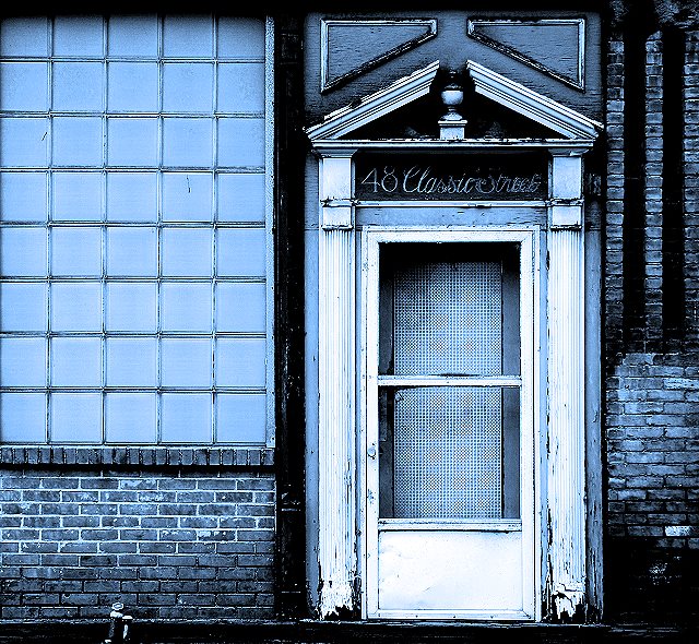
Chris, this is really good! It's like an architectural quilt, sewn together with interesting shapes and textures. It's a perfect subject and composition for duotone; in full color it might be too busy. Love the address on the door. It's "Classic". Awesome job.
Post actions
I loved this one Chris! I love the blues, the feel, the "natural grunge" like Germaine said :) Great job!
Post actions
What a collection of lines and geometric shapes with some natural grunge thrown in. I'm sorry I didn't vote on this one.
Comments Made During the Challenge
Post actions
Refreshing duotone after a long session of rating black-and-whites.
Post actions
Lots of detail. Nice tones. I love all the lines and right angles.
Post actions
This image works for me. Nice job.
Post actions
Post actions
Very nice, love the blue. Maybe a little too contrasty.
Post actions
Wonderful blue !! I'd be interested to know the original color.
Post actions
Very cool. I can see this hanging on a wall in just the right decor. Great job.
Post actions
Post actions
Great colour, it definitely adds interest. Good composition too.
Post actions
Post actions
this is so beautiful thank for sharing :)
Post actions
Great composition and processing (well, it's too blue for my taste, but that's irrelevent). This is a brilliant example of harmonious asymmetery. And it's much harder to do than it looks. 7.
Post actions
Excellent colour choice. It works well for this image, Well done.
Post actions
good color choice. it works well with the picture.
Post actions
Love the graphic, angled look. Super neat blue tones. NICE job. 8
Post actions
I like the processing a lot. To be truthful, it looks like a tri or quadtone, but I'm not going to knock you for that (since I have no way of knowing). 7






 Add photograph to your favorites
 Add photographer to your favorites

 Photographer found comment helpful.


