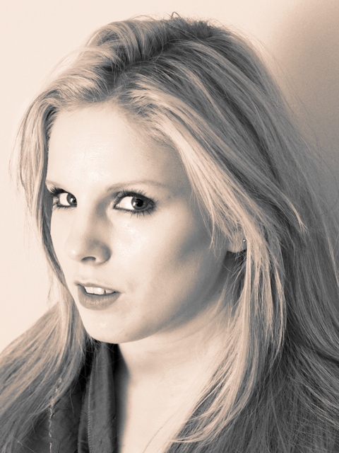
Shot using a reflector (to maximise the disctinct lack of daylight we get here in not-so-sunny Glasgow), as well as a bounce flash. The wall is lit with a slave flash.
Adobe Photoshop CS2: levels, contrast, desaturate, channel mixer (for the sepia tone as well as greater contrast between the tones), resize, save for web.
Many thanks to my lovely girlfriend Alexa for modelling.
Statistics
Place: 412 out of 631 Avg (all users): 4.8863 Avg (commenters): 5.7143 Avg (participants): 4.7835 Avg (non-participants): 5.0762 Views since voting: 1055 Views during voting: 380 Votes: 299 Comments: 9 Favorites: 0
As I've been going through some of these duotones results, the variation in scores is truly remarkable - I really can't seen anything to justify this image scoring way down here where it has. I'm not suggesting it's ribbon material, but really, 4.8?
I think the comments re the pose were right - she does look slightly discomforted, and a large part of portrait photography is the process of getting a natural look, be that knowing whihc poses will work as an image, or knowing when the discomfort starts to show, or simply being able to see through your lens what you may not see otherwise. As this is your girlfriend, it may simply be that you know here too well, and what we're all seeing as discomfort is simply the way she looks. Whatever it is, there is just enough of a sense of tension around the neck and angle of the head to put that feel into the shot.
Your lighting is also a slight let-down. The image-left side of her face is so very evenly lit and exposed that to me all sense of definition there is lost - the tone has become the same as that of the background, and there is a sense of shininess around her forehead and nose, so there's a feeling that you've gone for a high-key shot but not quite pulled it off.
I'm unsure about any of these points - I'm no portrait photographer, and no fan of the genre either - but just trying to explain why I think this scored so very badly. Undeservedly so to my mind.
Difficult to say on a large resolution screen, and therefore with a small image, but I wonder if you could have had more detail. In my experience of this place, I find that the voters like things a touch sharper than I think is 'real' - a final pass of Unsharp mask with settings of 0.6, 70%, clipping 5 makes a useful finalising step after re-sizing, in my experience, for here.
Couple of positive points, the focus is spot on and the catchlights in the eyes are nicely done. However, the pose is ...awkward due to, i think, you've asked your model to look round just a bit tooo far. The toning of the shot is nicely done high key but the rigid, awkward pose really lets the whole thing down.
My view of duotones is that they have rich black; this one is too light to fit that mold. But now I'm looking at it again and the lightness appeals to me more. Bumping up.






 Add photograph to your favorites
 Add photographer to your favorites

 Photographer found comment helpful.


