******** Greetings from the Critique Club ***********
Welcome to DPChallenge! Great to see you jumping in and entering.
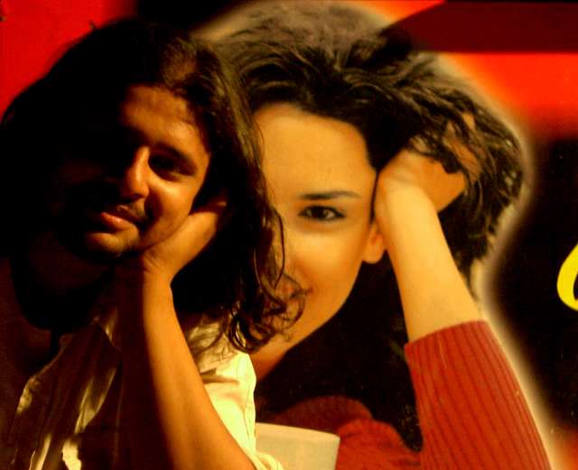
You have quite a few comments on this entry and I'm not sure I can add any additional insight. I would agree with those who saw the connection you were making with your subject and the background. The playful pose sits in front of the "professional" image revealing just the right amount to have us see both the parrellel and the connection to the theme.
The concept worked and the technical details are what held your photo back in scoring, imho.
A great attempt, but he is too dark and not sharp enough. The picture in the back looks sharper than he does. I would also have cropped the yellow letter out on the right. Maybe you could have used a small light on his right or a reflector to give the rest of his face a little detail.
Cute theme. Maybe tighter crop on the right to take out the remnant of print and bring her slightly out of center? Personally, my eye wants to go to the middle of a shot unless there's something very strong to take it elsewhere, and he's a little dark to automatically pull me over there, and with basic editing requirements... well, you know :)
The image is a bit dark, and I actually thought that the main subject was the girl in the background. Then I read the title. She is actually more in focus than he is.
The thing I like best about your shot is using the same pose as the sign - clever. The lighting is a bit on the yellow/orange side for my personal tastes, and I think it might work better if the letter on the right were cropped out.
Love the mirrored pose he's taken from the background. I think the problem for me here is the lighting. If his entire face was lit (as hers is) I think this would be a stronger shot. Maybe also a slight crop off the right side to get rid of that yellow curve.
This has potential. I like the concept, but the execution of it did not turn out as was perhaps planned. The subject in the foreground is poorly lit, waayy out of focus, and his pose is a bit off of the background pose.
Well, a little more crop on the right side, to crop off the partial yellow letter would have worked more in my opinion. But I like the snap. It is nice







 Add photograph to your favorites
 Add photographer to your favorites


 Photographer found comment helpful.


