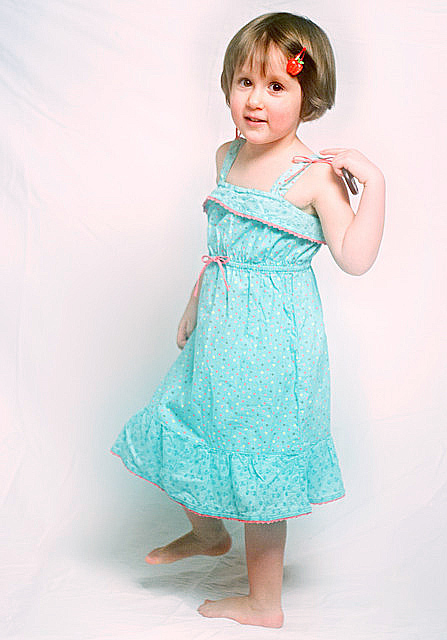
The color saturation is on purpose - some may like it while some may not. The votes will tell.
Challenge topic - meets the challenge in my opinion, but probably not the most original shot taken. Should not trigger many DNMC 1s or 2s... hopefully.
Postprocessing:
cropped
USM
curves (virtual photographer filter, but it can be done using curves, just did not bother trying to achieve the same effect manually)
save for web w/ resize
Neat Image
back to PS to sharpen again and adjust color balance (went too pink for some reason after all adjustments)
submit here.
Oh, yes, that's the lens cap for the 50mm f/1.8 I used to shoot this one.
Statistics
Place: 79 out of 133 Avg (all users): 4.9356 Avg (commenters): 6.3125 Avg (participants): 4.6452 Avg (non-participants): 4.9966 Views since voting: 1211 Views during voting: 496 Votes: 357 Comments: 18 Favorites: 0
I don't think this is a bad picture. I gave it a 5 and perhaps that was even unfair. I hit this close to the end and was starting to get voter fatigue with the posed portrait (which was 80% of the fashion challenge).
DPC may have a small backlash against "cute kids"; especially posed ones. I'm not sure. I use my kids and they have done well, but usually they are merely playing a part of a bigger scene rather than being the entire subject.
Your light is nice, I think. Fashion can definitely be high key and soft, which is what you have achieved. I've left plenty of comments on people's pictures about ironing sheets used for backgrounds. It's a pain, but those wrinkles detract. I doubt that was a big reason for your score here though as it is only noticeable in her shadow.
Really, I'm a bit puzzled by the score (even mine). On second view I'd give this a 6 which represents a solid picture in my view. Perhaps your cutie just couldn't compete with the 22-year-old vixens presented. But that may be a good thing...
Firstly, let me say, what an adorable little girl. She's really photogenic. That said -- I think you could have improved this shot dramatically with a few adjustments. 1 - Preparation - The wrinkles in your bg fabric are a huge distraction. I know ironing is a pain, but can make the difference between sloppy and professional in your shots. 2 - Pose - the pose shown here looks very uncomfortable to the viewer, one foot is turned inward, other is off the ground as if she's about to run away, the right arm looks natural and casual, but the left looks busy and distracted and yes, you should have asked her to put the lens cap down. 3 - Lighting - Its a bit over-bright and washes out her skintone in places. Did you add a white gradient??
In summary, the key to getting nice / pro looking portraits is preparation and patience. To my eye, this shot seems rushed and with little attention to detail, which hurts your overall score.
These comments are meant to be helpful and I hope they are taken that way.







 Add photograph to your favorites
 Add photographer to your favorites

 Photographer found comment helpful.


