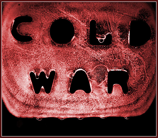
i will agree with the person who said the colour wasn't their favourite, but, i voted much higher than 5! still one of the best of the bunch, i think...
Great impact! How'd ya get the lettering in the ice? I like the play on the words with the cold/ice and I like how it shows the war's end with the melting. The color is not my favorite but I do think it gives the image a boost of drama. I'm not sure about the lighting. I feel like the whole image should be completely lit but.. it does work as is. My favorite portion of the image is the droplet in the "L". Nice. I gave a 6.
powerful, simple, and elegant. making a subtle statement about a time period, without resorting to dating imagery. very interesting indeed, an arresting image.






 Add photograph to your favorites
 Add photographer to your favorites

 Photographer found comment helpful.


