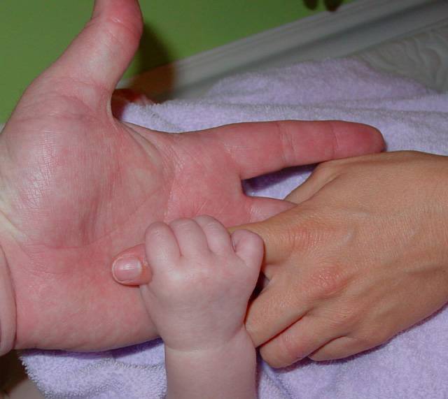
This photo shows my daughter's hand, my wife's hand and my hand underlying theirs. It may not be the most artistic shot submitted but it means something to me and I do want to stay with the community by joining competitions
Statistics
Place: 91 out of 123 Avg (all users): 5.0746 Avg (commenters): 5.6000 Avg (participants): 5.0988 Avg (non-participants): 5.0377 Views since voting: 1290 Votes: 134 Comments: 17 Favorites: 0
I think this is a great way to show a family bond, and the contrasts between each member of it. The background is a bit distracting with the green wall, and part of the mantle showing, it took my focus away from the hands themselves.
Great idea. A solid background would have really helped this shot -- or converting to bw so that the "obviousness" of the different colors wouldn't be noticed.
It's a ncie idea, and the little hand is certainly cute, and the contrast is definatly there, the lighting is what sort of "breaks" the shot. If this was an onboard flash, there's not much you can do, but with a little creativity, you can get your flash to bounce off the ceiling (i sometimes use a cd to bounce the light). This creates a softer flash, and prevents the harsh shadows created by a flash. then again, i could always be completly wrong that it was a flash.. in any case, the harsher shadows isn't the bes quality of this photo. Good attempt though, 6.
this is such an beautiful and touching photo that it deserves more post processing to make it what it could be. I'm giving it a 6, but it could easily be an 8 ot 9 with a litle work. PM me after the challenge is over if you want me to take a look at it. cheers!
This is the third time I have looked at your photo. Each time I have an urgency to replace the background. If it were black, it would knock em out. Please do it again, but with black. 7
I've just had my 1st baby, so I know how much meaning this shot has for you - there's a real sense of family here. However, photographically, I feel that it's important not to forget the basics. Here, the flash caused a few core problems, the harsh shadows and the blue tinges, especially on the white towel, and weak colours in the top right and bottom left. Also, take care about the background. The green doesn't help at all, the skirting board presents a conflicting line and there's a thingy hanging down in the top centre.
Good idea for contrast however this isn't a very appealing photo. The lighting is very flat, and the shadow especially from the man's hand is rathher annoying. A solid background might have been nice... as well as having the man's thumb in the photo. Black and white might have been nice for this.






 Add photograph to your favorites
 Add photographer to your favorites


 Photographer found comment helpful.


