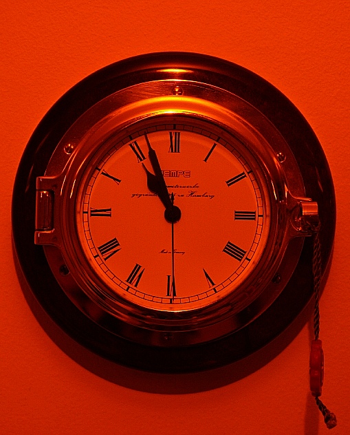
I like the strong duotone colours, probably the richest in the challege. The subject isn't really interesting (to me), and a little grainy on the clockface.
picture is good, the number four on the clock thought should be IV, according to the roman numerals, my daughter noticed this on a alot of the clocks, so now I do too.
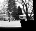
title is great - would have liked to see more light toning here as well as a more interesting POV. The toning can be achieved by desaturating and colorizing if using Photoshop.





 Add photograph to your favorites
 Add photographer to your favorites


 Photographer found comment helpful.


