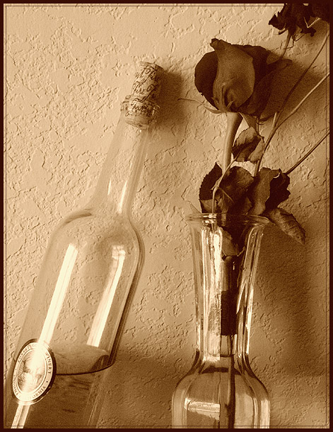
Very nice treatment. This shot's lack of a true white point is not a weakness as the whole image sits under a color cast that seems intended to soften the color palette and lend an emotional air for the viewer to pick up. Love how the bottle's angle mirrors the stem/branch coming from the vase. The lean feels unnatural but the fact that it balances the angles on the right side of the shot help me to notice its lean and overlook what could be taken as contrived. I'm not a fan of the inner key-line for this shot; it seems I infer a poster print from this line alone. The darker tones of the petals seem to contain some noise that doesn't enhance the image. Nice conversion.
Great use of background to make the bottles look transparent. Well composed. For some reason, I did not like the rose on this one. Maybe a different flower would have made the composition more agreeable, but that is my opinion. Others may love the rose.






 Add photograph to your favorites
 Add photographer to your favorites


 Photographer found comment helpful.


