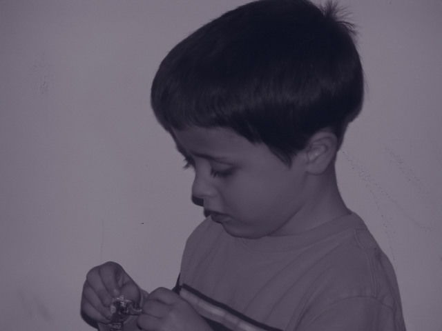
"...where your image fell flat on many basic fronts without doubt or question. The usual stuff, sharpness, contrast, darkness, composition, interest and most important....why did you give it that purple tint and how did that enhance the image???"
Regardless of whether you made your photographic descisions with direct intent or purpose, none of those choices worked or were effective in the end result. That's just an opinion, of course but in my view that could be why things stacked up as they did.
It's a good candid shot with a great expression on his face. Almost great compostion with the boy's position and the plain background. The chopped off head and hand and low contrast stop this from being a really great shot.
This image could have been enhanced further by separating the subject from the wall to avoid the distict shadow running past its nose. I will not question the lack of contrast in the event that you want to convey contemplation. 6
Hopefully your time at DPC will improve your photography from basic snaps to more accomplished portraits...
this snap is underexposed and onboard flash has given a very unflattering shadow which is most evident behind his mouth, nose and eyes. Choosing blue as a duotone gives an emotionally cold effect which doesn't suit this image. Composition doesn't seem to have been thought about, he would have worked better on the right hand edge of the frame. You've chopped off some of his hands which he's concentrating so hard on. The marks on the background are distracting.
The shadow that the flash has made has given this image a real snapshot feel to it, also the focus isn't really sharp enough and affects the quality of the picture






 Add photograph to your favorites
 Add photographer to your favorites

 Photographer found comment helpful.


