I hope I have done this correct
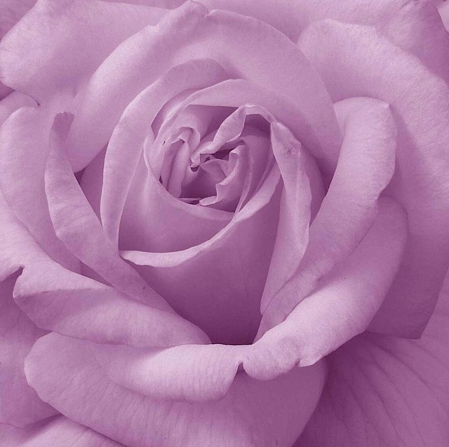
Cropped the Rose from a larger image and changed to B/W in Adobe then tinted the colour in use hue and desaturated until I got the desired effect
Slightly sharpened and downsized for site
I used the basic colour of the Rose
Statistics
Place: 211 out of 631 Avg (all users): 5.3911 Avg (commenters): 7.8000 Avg (participants): 5.1897 Avg (non-participants): 5.7526 Views since voting: 1566 Views during voting: 330 Votes: 271 Comments: 13 Favorites: 1 (view)
This is excellent! Everything's in sharp focus (except for just a tiny bit on top), the colors are great, the rose is perfect. It's fit's the challenge nicely. There's not a lot of contrast, but it's not needed - the softness is very nice.
The Composition is good, but I think it would be a bit better if the center of the flower was right dead on an intersection of thirds. In my opinion, here at dpc, it's hard to predict how a flower shot is going to do. Sometimes people just like 'em, other times - not so much.
I really like the way the lighter purple tones in this emphasize the soft look of the petals and the darker tones emphasize the veins and depth of the flower.





 Add photograph to your favorites
 Add photographer to your favorites

 Photographer found comment helpful.


