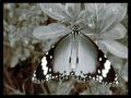
On my screen the tone is too pinkish and overall the light obscures some of the detail that would give more impact if it were darker. The composition is good and the subject is very interesting. In this case I think the tone compromises the overall value of the image.
love the composition of this shot and the colours work well. I think adding more contrast and a levels layer to avoid blowing the highlights would help it to really pop.
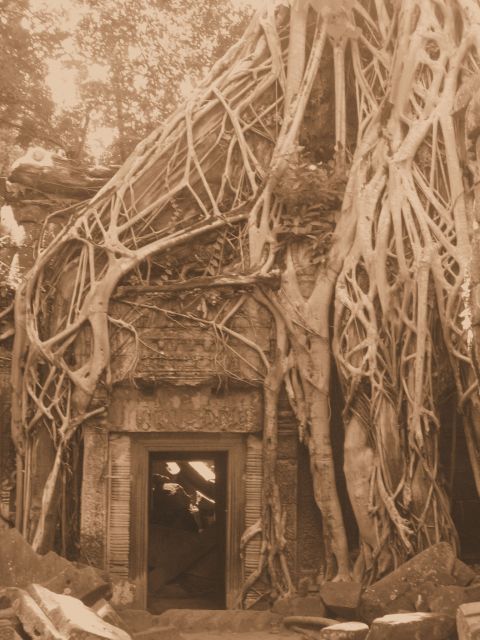
Had the overall image been more in focus, I would have scored this better. I like the sepia tone. It gives your shot an old feel for me. Great overgrowth.
An interesting subject. I like the composition. I'm thinking the presentation could be stronger with more contrast. Maybe just some levels tweaking could greatly enhance the light to dark tonal range. It seems just a little 'flat' here.






 Add photograph to your favorites
 Add photographer to your favorites


