The first three parts of this critique are written based purely on examination of your photo. "Final thoughts" is written after reviewing your score, photographer's comments, and voter comments.
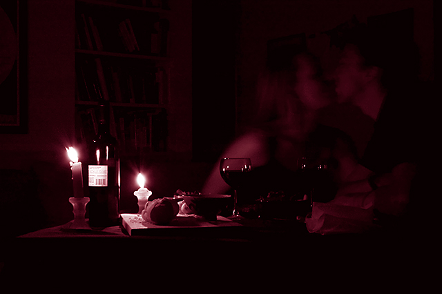
TECHNIQUE While you were obviously going for the dimly lit ambiance, the result may be a bit too dark. Even on my relatively bright LCD monitor, there are too many areas in the photo that are overly dark, and devoid of any detail. It appears as though the candles were the only sources of illumination. While it creates a lovely effect - and I think it worked well overall - it does leave, for example, the girl's face in shadow, while her upper right arm is the brightest object in the scene other than the candle flames (and objects closest to the candles). When dealing with scenes were lighting is so central, keep in mind the inverse square law of light intensity. An object twice as far from the illumination source will only receive 1/4 as much light. Look, for example, at the near wine glass as opposed to the far one, and the illumination of the near wine glass compared to the man's face. It would have been effective to have had at least one more candle out-of-frame to the right, to add some balance to the lighting, while preserving that soft candlelit ambiance. Focus is sharp and I like the fact that your depth of field is large, preserving the bookcases in the background. Books make beautiful backdrops, in my opinion, for a shot like this. Your choice of a reddish duotone is excellent, and complements the title link to Valentine's day, as well as the red wine.
COMPOSITION I think the composition is very clean and well balanced. I might have cropped a bit tighter to eliminate some of the dead space along the bottom, but that's relatively minor. Referring again to illumination, and how it impacts here on composition, consider the label on the bottle of wine. Bright white and only inches from the light, it becomes the brightest object in the picture, other than the flames themselves. It looks like you rotated the bottle intentionally to hide the larger label (good thing too), but you probably could've removed the label entirely for better effect. One more minor quibble, the candle flames are tilted slightly to the left. I've tried photographing candles before and I can attest to how damned difficult it is to still the air entirely. From that perspective, you did very well, but the slight tilt is annoying. Straight-up steady flames would be sooo much more pleasing to the eye. Overall, it's a very simple and logical composition.
EMOTIONAL IMPACT In my view, this photo had the potential to be much more memorable if it had been a bit brighter. I'm guessing most viewers appreciated the artistic merits, but were frustrated at the dimness. Dim photos just can't "pop" the way brightly lit, colorful ones can, making this genre of moody photos very difficult to pull off. In conclusion, I think the impact of your photo was dampened by the darkness - moody candlelit scenes are a challenge to the photographer to find the right balance.
FINAL THOUGHTS Reading over your comments, it is very clear that my hunch about the overall illumination of the scene was correct. Most computer monitors just didn't do justice to your shot. Nearly every commenter expressed some variation on the "too dark" theme. Your final two commenters during the voting, Yanko and Alecnorman, are using bright LCDs, I'd bet you a bottle of wine! If you are using an LCD monitor (as I am) to edit your shots, make sure you have a chance to preview them on a CRT before submitting. In conclusion, I liked your shot a great deal, but you were doomed from the start by the darkness of the scene, particularly the right half where the subjects are located. Your final score of 4.9 almost certainly reflects this fact, quite apart from strong merits of your concept and composition.
Great duotone color and the lighting really works. I especially like the reflections in the glass and the detail you captured in general. Overall, you really captured the essence of the moment. I can definitely see this as a ribbon winner. Gets a 9 from me.
Nice moment. Should have rotated the wine bottle so that the front label is visible. As it is now you see the bar code... which isn't very romantic. Hard not to see this because of the highlight from the candle.
A nice idea. The image is underexposed, though, and the candle flames are blown out. The tone matches the idea, but the overall detail is lacking, as well as too much put in the image. Need to simplify, get better exposure, and focus needs to be better.
I like the idea, but the figures are a little dark. The lighting situation makes for a difficult time capturing proper exposure. I like the details in the glass though.
The deep bordeaux coloring compliments the theme quite nicely...my only gripe would be that on the bottle of wine, I may have turned it around so we the viewer would not see what looks like the UPC scan label...kind of dampens the romantic feel a teeny bit...still very nice .
While not realistic, you might have been served better by having the candles (and their light) closer to the couple, since they are more the "Valentine's moment" than the wine. I like the setup and the framing.
Very dark on my monitor. The duotone match is really nice and adds beautifully to the sense of the scene. Technically....needs to be a bit brighter and you could have cropped a dash from left side of the image IMO. Good Luck!





 Add photograph to your favorites
 Add photographer to your favorites

 Photographer found comment helpful.


