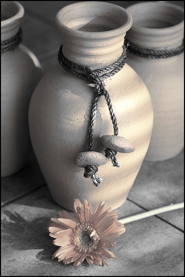
this was one of my top picks for this challenge even though it was not a true duetone but a desaturation (this may have accounted for the low votes)
I just love it anyway and have added it to my favs :)
I didn't vote but I like this very much. The tones and the contrast are excellent. I think it should have scored much higher, not that 5.987 is a bad score. If your composition had not been so straight on it would have scored higher I believe, i.e. the main pot could be left or right of center and the flower diagonally opposite the pot. I think this would have been much stronger compositionally. Voters at DPC tend to be pretty anal about the rules of composition I find.
Out of all the floral or flower type of entries this is my favorite. Very delicate shading and toning. I think it matches perfectly with everything. I gave it an 8. I guess I am just not that much of a flower lover.









 Add photograph to your favorites
 Add photographer to your favorites

 Photographer found comment helpful.


