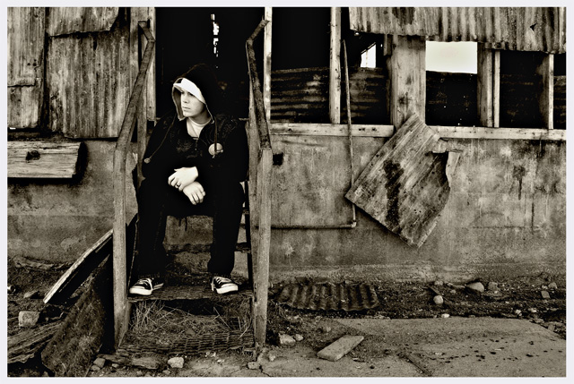
I like the end result, but once again I really have no clue as to how this will do. To me the surroundings make this shot...no sure that I do a whole lot for it though! :)
Statistics
Place: 74 out of 631 Avg (all users): 5.8650 Avg (commenters): 6.8182 Avg (participants): 5.7514 Avg (non-participants): 6.0594 Views since voting: 1325 Views during voting: 375 Votes: 274 Comments: 12 Favorites: 1 (view)
Going for the grunge look are we? I would like it better if you stood out a little bit more. Another thing to consider is that there seems to be some perspective issues regarding the wall sof the house, as they seem to slope off (or maybe the building is just that dilapidated). This could easily be fixed however by going to Edit>Transfomr>Perspective. Just my two cents.
No offence, but I think this would have looked better without you in it. The rustic look of the old building really lends itself to the sepia. The addition of something 'modern' (you) detracts a little IMO. Still scored it well tho.






 Add photograph to your favorites
 Add photographer to your favorites

 Photographer found comment helpful.


