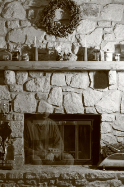
I love the overall idea behind the image. I do think it is a bit narrow. Meaning it gets the fireplace and mantle but makes everything vertical. And competes with the mantle and horizontal stone piece. Witht he exposure it has made the lighting a bit hard in places. But it did do a nice job on creating depth to the stonework. It does seem to be out of focus or soft in places. Probrably do to the lenght of exposure. I would have liked to seen less clutter. Often in these critiques it is the critiquers personal choices. Does not mean they do not value your choices and ideas. Do your photography how you like it. But I think a wider broader image maybe cropped just below the mantle would have worked out somewhat better. Good luck and never give up.
Very interesting concept. I think the mantle and things should have been in focus. It seems like they are a bit blurry. There also looks like there is a bit of a tilt to the left, it could just be an optical illusion though (I didn't measure it).






 Add photograph to your favorites
 Add photographer to your favorites

 Photographer found comment helpful.


