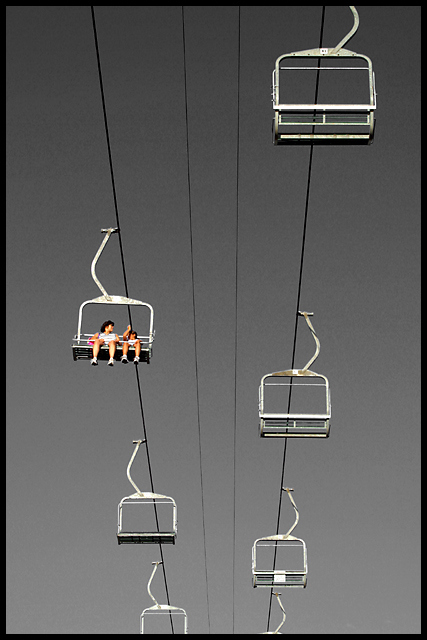
Composition: The composition is very strong. I like the simplicity. For example clouds in the sky would have been very distracting in my opinion. The diagonal lines draw your attention to the bottom of the photo. I think it's good as it is now but I wonder how it would look like if the people would sit in the chair on the right lane near the bottom.
Lighting: Exposure is good. The selective desaturation is subtle but fits very well. This is the "icing on the cake".
Focus: The narrow aperture was a good choice. I think a shallow DOF where maybe some of the seats have a softer focus wouldn't look as good as it's now.
Challenge: I think this is the weak part of the photo. Don't get me wrong. It is technically a great photo and in my opinion it also fits to the challenge. But when you look at some of the other top-photos (e.g. the winner) then you see that there is a great contrast regarding the subjects. I see contrasts in your photo, too. E.g. the empty seats vs. the two people and also colour-wise, but it's a bit too subtle to be recognised immedeatly and also not very strong (as compared to for example the hands of the winning photo).
Creativity: Well, the photo certainly does not look like just a snapshot. The composition and the selective desaturation sure shows creativity.
Ok, I probably couldn't help you very much. But this is also because your photo would have been a 10 in my book. It's hard to write a CC critique for good photos :)
I thought this would be right up there - which i guess it is, but i was thinking ribbon time, so slight commiserations from me. The desaturation trick, which i usually find just to be a cheap way of adding impact to a shot, is so well done here that I barely registered it. excellent work.
How have you lost the sky colour without spot editing? Perhaps a blue hue drop out? Very stylish shot if it's legal. Great composition and capture. [8]
This is my top pic of the week. I love the story told in this picture. The two people being the sole riders and also being the only color object make for a great angle on contrast. Nice sharp image with great b/w treatment! 10 -danny
A contrast not many had thought of, good work. It almost appears to be black and white until you se the splashes of colour. Slightly noisy sky (sharpening?) and if you'd have taken the shot slightly later the positioning of the seats would have been more pleasing to me (no accounting for my taste though!)
Very neat...really neat. Only critique would be my preference to have the backdrop lighting more even across the image rather than darker at the top. Thanks
I love the clean graphic nature of this shot.. the framing is excellent and the contracst between the sky and the people is great.. I hope this is a winner!
The two things that 'get' me about this shot is the emptiness in it, I think it is great, and I love the black and white tones in contrast to the color people. The lines too are clear, simple and add to the perspective. All around really nice. very nice.






 Add photograph to your favorites
 Add photographer to your favorites


 Photographer found comment helpful.


