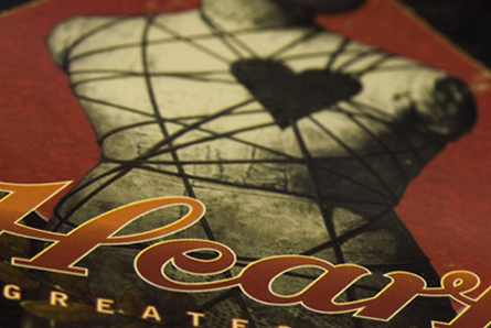
It's a nice shot, but it lacks any real 'punch'. I feel that the shot has been cropped a little too close to have enough impact.
Lighting:
Seems ok, although it is quite hard to tell. There are no patches that look odd, so in that respect it is adequate.
Focus/DoF:
Good creative use of DoF - although I would prefer to see the text more in focus. It seems to me that the focus is sitting right at the top of the 'H' and it is a little hard on the eyes.
Colour:
Again, there is nothing here that jumps out as either good or bad. There seems to be a good balance on the whole, and it looks to be an accurate representation of the real object.
Composition:
I notice there are some comments regarding the black corners, and suggestions they be cropped out. Looking at the photo, I'm not sure that's possible, but I would have preferred to see the writing a little higher in the photo. This could also have helped with your focus too.
Subject/Meeting the Challenge:
It feels 80's to me. I note there are also comments regarding the potential representation of artwork - I *think* you are in the clear with this due to the focus and composition, but it is a grey area, in my opinion.
Final thoughts: I would suggest, that when you ask to have an image commented on by the Critique Club, you include your camera settings and give us a little hint in the Photographers Comments column of what your thoughts/intentions were when you took the photo.
Nice image, lighting looks okay and the focus seems to be good, but I can't tell where the photographer's creativity came in here. To me it looks like a picture of an album cover (which I could easily be wrong about but may be against the rules?) so in general its a nice image but I don't see much soul to it and it doesn't really draw me in. I gave a 4
For me, this borders on the edge of the Literal Artwork rules... there's a bit of creativity with the dof, but it's mostly just a shot of an album cover. Perhaps adding the cassette/record that came with it in a creative arrangement?





 Add photograph to your favorites
 Add photographer to your favorites


